Jason Dwyer - Designer + Illustrator

  • Latest illustration for an article about the battle to eat healthy. As is the case with many people, a favourite snack food like potato chips can be your kryptonite, standing in the way of a clean eating regimen. Substitutes are usually tried, but to no avail...in this article a particular hatred is developed for kale chips.

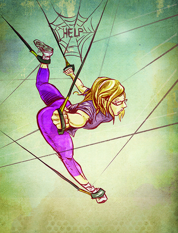
    Done in ink with digital colour, I started out quite abstract in the rough work, just trying to establish a strong feeling of being weakened by the chips in the pose. I also threw in some Superman references like the red and blue colours, and the draped couch blanket which hints at a cape.


    Continue Reading
    Here's a recent illustration I did for an story about childhood sports endeavors. These tales tend to become either filled with deeds of heroic athleticism or full of impressive misadventures as time goes on. That's what makes them good stories after all!

    In this particular instance, the author recounts a short stint as a star grade school pitcher, whose career was ended before its prime by a wayward line drive. Since it took place in the late 70's I wanted to capture that old baseball card spirit and summer camp sort of vibe with the wardrobe details. Technique-wise I experimented in contrasting smooth characters with a textured construction paper type feel for the rest of the scene, set with an outdoorsy colour palette.
    Continue Reading

    Inspired by the amazing work being done by comic colourists, I wanted to explore adding some dramatic lighting and atmosphere to a quick inked sketch. Even though the image I was working with wasn't very dark, it lended itself to being heavily in shadow. I wanted to capture a sort of haziness with a bit of dim lighting coming from a window so I built up different layers of desaturated colour and filled in large dark areas to accentuate the highlights. I finished off with some rougher texture to give it a grittier flavour. These are two of my favourite colour experimentation results.
    Continue Reading

    I've been looking at this abstract print for a really long time, and have concluded that it has to be a jaguar. Maybe a hyena even, but mostly jaguar. Printmaking can be an enlightening process as it forces you to rely less on drawing and more on solid areas, and prevents you from becoming too focused on details.

    The original was done as a black print on white paper, with oil paint on glass and has been sitting around for a while, so I thought I'd lend it some new life. Some digital colour and texture were all it needed in Photoshop to make it a bit more interesting, though no less mysterious.
    Continue Reading
    Here's a new illustration for an article on fun winter activities to explore in The Great White North. Some of the other adventures included skating and cross-country skiing, but I focused on dog sledding since it always seems so chaotic. A bunch of maniacal runaway huskies has good action potential.

    The art started out with an inked drawing, and I decided early on to focus on adding winter atmosphere as opposed to clean digital colours. The sunset surrounded by greyness and swirling flurries helped to pull it together and add an obvious sense of the frosty Canadian winter.
    Continue Reading
    I had the chance to take some more food pics, this time from a fun and experimental summer menu launch. To go along with the food, I thought I'd continue on with some textural explorations, seeing what would compliment the food shapes and styles. More time-consuming than Instagram filters but you can get a lot more creative. All of the images were taken with no setup or lighting and a 50mm lens.


    Continue Reading
    Looking through different location reference photos called my attention to the new cultural phenomenon of phone addiction. I mean, I knew about it of course, but it's not something you digest the full effect of until you see it made obvious. Twenty years ago, if you were to look through photos, you wouldn't find people sitting around playing with their phones in the background. I'm not sure what they would be doing, if anything. Maybe they'd just have their hands in their pockets instead.

    Observations like this are important because artists need to replicate reality often. Patterns, groupings, the way objects fall naturally are all subtle details that make a setting believable. So if you're doing an illustration of a crowd now for example, making it current would require a bunch of people texting on their phones. And more specifically everyone has their own technique too. Index finger tappers, piano fingers, thumb shovers...all different ways you'd see people using their phones.
    Continue Reading

    Since it seems that winter wants to hang around for a while still, here are 2 quick vignettes, inspired by the cold temperature and grey landscape.

    The first is a photo collage, pieced together with some random photos and some textures I had lying around. Just an excuse to play around with a cool palette, which I don't usually restrict myself to.

    The next is a doodle done with leftover paint. The thought popped into my head that winter is also about rosy cheeks and knit patterns, so I tried to sum that up in under a minute with only a few brushstrokes.
    Continue Reading
    I thought It would be fun to add some colour to this recent sketchbook drawing of a girl in London. The photo it was based on had some interesting lighting...that really bright golden sunset kind, where you feel like the light is almost shining right through things.

    I didn't want to replicate the photo in any way, but instead was looking to capture the actual feeling you get, being in a place at that time, where everything seems to be glowing and hazy. I found that by adding colour overlays and various tweaks, I was able to enhance the drawing, and give it the dreamy quality it needed.
    Continue Reading
    Here's a recent illustration I did for an article about discovering yoga. It explores the ups and downs of the yogi boho life for the unathletic and how as it turns out, it can be pretty relaxing. It's just a different sort of me time.

    For the artwork I wanted a fun drawing with some cool drowsy tones. I've been enjoying watercolour lately and it just felt right to throw some in to add a little texture and moodiness.
    Continue Reading
    Here's a little drawing of a house downtown I've been working on. Some houses can be pretty broken down and uncared for, and giant eyesores...but if every house was a brand new executive in the suburbs there wouldn't really be anything to draw. Buildings have unique character just like people, from the cracks in the walls to the style of window pane.

    This particular house had a lot of random unique details that kind of called out to me. Crazy chipped walls, uncut grass, white mod chair, broken shades...the list goes on. I just thought it would be a fun subject to experiment with layering on top of an ink wash. I drew out the house more detailed than normal in pencil, then did a grey wash over top to start. After that I added in some digital colours, tweaking some of the watermarks, and really exaggerating the aged feel with some grunge brush texturing. At the same time I was trying to picture what it might have looked like brand new in all its glory, without the dirt cloud of neglect
    Continue Reading
    A good drawing is an important starting point, but it doesn't always end up producing a good illustration. Things like emotion, atmosphere, colour, composition and purpose all come into play and can throw your artwork off. Sometimes I'm haunted by messing up a drawing or concept that I thought could have been way better.

    Take this idea of a girl wearing her heart on her sleeve, and a boy being a potential heartbreaker. I initially did it over six years ago. Pretty ancient. And not the most original idea, but I liked certain aspects of it and felt I didn't do it justice. Both the original and the reworking were way to dull. Over inked, boring colour and no emotion which was vital to the idea. I finally gave it another go, giving it a warm atmosphere with a watercolour effect while taking out detail and the background, and then dropped in a hand drawn song quote as well. I think overall it sets the mood much better, and for now I can finally sleep.

    Continue Reading

    Here's a recent illustration I did for an article about what it's like being introduced to TRX - Total Resistance Training. Gyms continue to offer increasingly unique and imaginative ways to get fit, and TRX is no exception. The main premise is resistance band training, much of it while suspended in the air in awkward positions. To new-comers brave enough to try it out, it lends itself to getting caught tangled up in a bunch of strings, like helpless prey in a spider's web.

    I wanted the drawing to tread the line between limbs flailing wildly and new found acrobatic abilities, while sticking with the prey analogy and showing a sense of vulnerability with negative space. The art was drawn and inked and then coloured and textured digitally in Photoshop. I also couldn't resist the Charlotte's Web reference, since really, how often does the opportunity ever present itself?
    Continue Reading
    Just keeping busy with some little author spot sketches. Since it's hard to sync up contributor photos to look the same without an actual photo shoot, magazines often use illustrations instead. Sometimes they can even be some of the best art in a publication. It's too bad that most people skip over the contributor page because it always ends up buried somewhere near the front between a bunch of ads.

    These portraits were done in ink, with some digital grey wash added, and benefit nicely from being shrunk down in size from the original art.
    Continue Reading
    Check out the impressive movie inspired artwork by Massimo Carnevale. I don't know much about him, other than that his blog has literally tons of these paintings. Your favourite movie is probably there...he's got all the greats ranging from Back to the Future to The Goonies. His painting style reminds of a digital Drew Struzan, the king of hand-painted movie posters.


    Continue Reading
    As we find ourselves well into Awards season, the usual debates continue to heat up about which director deserves which trophy, and whose boring artsy flick is overrated, who got snubbed and so on. The biggest debate usually ends up being about how well a host fared, and the recounting of previous poor selections to the job. No stranger to hosting gigs, British comedian Ricky Gervais managed a three-peat at the Golden Globes, with his sometimes offensive, sometimes more offensive, yet always quaintly humorous jabs. Strange that for a creator of several successful BBC shows (including The Office), movie actor, comedian and producer, one of his most memorable roles has been hosting awards shows. I like to think it was his ability to not hesitate to put his foot in his mouth whenever the situation called for that really sealed the deal, and cemented his all-time classic host status. Gervais is funny because he has no fear.

    This portrait of Ricky is done in pencil with some digital colours. It started out as a sketch trying to capture his smile which tends to be more of a grimace really, and since I thought it was going in the right direction, I polished it off with a bit of shading and texture.
    Continue Reading
    I don't get around to making updates on my main website jasondwyer.ca very often. I guess it's just more interesting to blog about projects I'm currently working on. Something I did decide I wanted to add to my site for the new year though, is a handful of my photography.

    My photos have gotten to the point where they are not so embarassing, and also a medium I find I'm working in more. Often I might be doing photography, illustration and design all on the same piece, so it seems like photography has found its way into my workflow as another way I can have more control over the final results. And with Photoshop I can basically edit or turn an image into whatever I'm picturing in my head rather than being stuck with something that's existing.

    I've added a showcase of different pictures, ranging from gourmet food and advertising to travel snapshots and magazine portraits. Most of my photography is done with my lovely low-end Sony Alpha and a 50mm portrait lens.
    Continue Reading
    This was my favourite in a series of spot style illustrations for an article based on the number eleven, and its personal meaning to various authors. In this case, the author, a high-energy, loud, seize the day type, was reminded that his personality is much like the Spinal Tap movie. He goes up to 11.

    I worked in a more simplified than usual style for the series, going completely digital and focusing on the conceptual idea. My favourite part was coming up with a visual way of working the number eleven into each illustration. Snuck them in here using the shape of the prongs.
    Continue Reading
    In the age of the finger, when digital devices are all controlled with subtle flicks and pinches, the uniqueness of one's own fingerprint can be easily forgotten. Digital artist il Dito (Italian for finger) takes this idea further by stating that we live in digital lives, hiding behind masks, afraid of our own fragile fingerprints. Enter Ditology ... his series of finger tip portraits, capturing likeness ranging from Steve Jobs and the Dalai Lama to himself, all on the tiny finger size scale.

    The simplification of characters works like a charm, their likenesses easily recognizable, despite being limited to a finger-tip shape. Dito explores a wide variety of subjects, showcasing just how limitless his chosen medium is. Hair, masks, make-up and glasses all add in the subtle details that make his tiny portraits visually huge.
    Continue Reading
    New illustration out about a first-time golfer's experience trying to learn the game. Which, as it happens, was full of follies and frustrations. This one ended up a little more colourful than normal on account of the pink. As well, since the inking is looser than usual, I actually went in with some detailing and did a bit more than flat colours.
    Continue Reading
    Older
    Stories

    About me

    Photo Profile
    Jason Dwyer Designer/Illustrator

    Jason is a multi-discipline artist based in St.Catharines, Canada, working on projects across the creative spectrum including graphic design, web design, illustration, branding, photography and fine art.
    jasondwyer.ca

    Follow Us

    • twitter
    • instagram

    recent posts

    Most Popular

    • New Old Zehrs logo
    • Paint it Black-Awesome Inkers
    • Mr.Dressup Craft Time
    • Brand New Portrait

    Blog Archive

    Labels

    • Jason Dwyer
    • Jason Dwyer design
    • Jason Dwyer illustrator
    • Jason Dwyer painting
    • Niagara artist
    • Photoshop
    • advertising
    • book illustration
    • branding
    • colour
    • comic
    • conceptual
    • creativity
    • design
    • digital art
    • doodle
    • drawing
    • editorial illustration
    • environmental signage
    • food photography
    • gallery
    • graphic novel
    • hockey
    • home reno
    • illustration
    • ink
    • inspiration
    • landscape
    • media
    • mixed media
    • packaging
    • painting
    • photography
    • portrait
    • printing
    • review
    • sketching
    • travel
    • typography
    • urban art
    • web design
    facebook Twitter instagram pinterest bloglovin google plus tumblr

    Created with by BeautyTemplates | Distributed By Gooyaabi Templates

    Back to top