Jason Dwyer - Designer + Illustrator

  • Latest illustration for an article about the battle to eat healthy. As is the case with many people, a favourite snack food like potato chips can be your kryptonite, standing in the way of a clean eating regimen. Substitutes are usually tried, but to no avail...in this article a particular hatred is developed for kale chips.

    Done in ink with digital colour, I started out quite abstract in the rough work, just trying to establish a strong feeling of being weakened by the chips in the pose. I also threw in some Superman references like the red and blue colours, and the draped couch blanket which hints at a cape.


    Continue Reading
    Here's a recent illustration I did for an story about childhood sports endeavors. These tales tend to become either filled with deeds of heroic athleticism or full of impressive misadventures as time goes on. That's what makes them good stories after all!

    In this particular instance, the author recounts a short stint as a star grade school pitcher, whose career was ended before its prime by a wayward line drive. Since it took place in the late 70's I wanted to capture that old baseball card spirit and summer camp sort of vibe with the wardrobe details. Technique-wise I experimented in contrasting smooth characters with a textured construction paper type feel for the rest of the scene, set with an outdoorsy colour palette.
    Continue Reading
    Here's a recent illustration I did for an article about discovering yoga. It explores the ups and downs of the yogi boho life for the unathletic and how as it turns out, it can be pretty relaxing. It's just a different sort of me time.

    For the artwork I wanted a fun drawing with some cool drowsy tones. I've been enjoying watercolour lately and it just felt right to throw some in to add a little texture and moodiness.
    Continue Reading

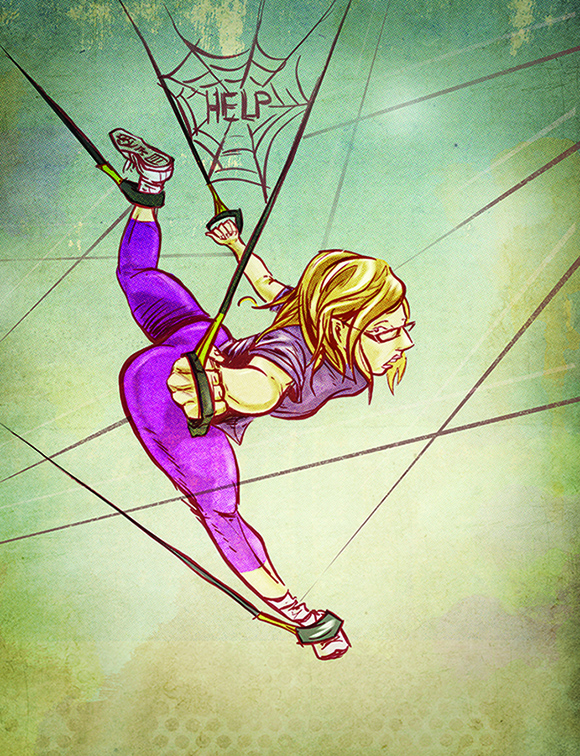
    Here's a recent illustration I did for an article about what it's like being introduced to TRX - Total Resistance Training. Gyms continue to offer increasingly unique and imaginative ways to get fit, and TRX is no exception. The main premise is resistance band training, much of it while suspended in the air in awkward positions. To new-comers brave enough to try it out, it lends itself to getting caught tangled up in a bunch of strings, like helpless prey in a spider's web.

    I wanted the drawing to tread the line between limbs flailing wildly and new found acrobatic abilities, while sticking with the prey analogy and showing a sense of vulnerability with negative space. The art was drawn and inked and then coloured and textured digitally in Photoshop. I also couldn't resist the Charlotte's Web reference, since really, how often does the opportunity ever present itself?
    Continue Reading
    Just keeping busy with some little author spot sketches. Since it's hard to sync up contributor photos to look the same without an actual photo shoot, magazines often use illustrations instead. Sometimes they can even be some of the best art in a publication. It's too bad that most people skip over the contributor page because it always ends up buried somewhere near the front between a bunch of ads.

    These portraits were done in ink, with some digital grey wash added, and benefit nicely from being shrunk down in size from the original art.
    Continue Reading
    This was my favourite in a series of spot style illustrations for an article based on the number eleven, and its personal meaning to various authors. In this case, the author, a high-energy, loud, seize the day type, was reminded that his personality is much like the Spinal Tap movie. He goes up to 11.

    I worked in a more simplified than usual style for the series, going completely digital and focusing on the conceptual idea. My favourite part was coming up with a visual way of working the number eleven into each illustration. Snuck them in here using the shape of the prongs.
    Continue Reading
    New illustration out about a first-time golfer's experience trying to learn the game. Which, as it happens, was full of follies and frustrations. This one ended up a little more colourful than normal on account of the pink. As well, since the inking is looser than usual, I actually went in with some detailing and did a bit more than flat colours.
    Continue Reading
    Here's a recent illustration for the current issue of WO Magazine. The article explores a woman's adventures in strength training class, and the motivational role the instructor plays. Exercising in a group setup is a good way to push yourself, for fear of embarassment, however sometimes you get more than you bargain for. I felt like trying something a little different with this artwork, and chose to go without inking, opting instead to use the original pencil drawing. Sometimes using a sketch can add a bit more energy to a piece, though I don't know if I would consider doing it regularly. On top of the drawing I added some digital colour, and a bunch of texture to give it a handcrafted feel.
    Continue Reading
    Art always goes through different stages, starting from just an idea doodle, to something more grand and complete. That's one of the great things about creating...you get to watch a concept grow. Sort of like planting a garden, you get the seeds planted, toil away in the hot sun and eventually (hopefully) enjoy the fruits of your labour. Here is an inside peek at my creative process for a recent illustration in WO Magazine.
    1. Idea Doodle
    This is where the idea takes place and I experiment with different thoughts and compositions. It can be the worst most crude drawing ever...in fact sometimes I wouldn't even consider it a drawing. More like some basic mapping language.


    2. The Drawing
    Most of the work happens in the drawing stage. It involves fleshing out the idea into a recognizable form using your thoughts, reference material, and the overall vibe the drawing gives off. Once the composition feels right, I then go in with a darker pencil and finalize most of the details. Once complete I typically ink with a brush pen.


    3. The Finished Colour Piece
     In this case, I scanned the artwork and cleaned it up before adding digital colour in Photoshop. I'm often not sure what direction the colour will take at this stage, and just let it build up on its own. Sometimes I'll add in some finishing texture in this stage too, and then it's all wrapped up and ready to go.
    Continue Reading


     I recently found out my submission has been chosen to appear among some of the industry's best, in this year's Applied Arts Photography and Illustration Annual. I'm particularly happy that I will be featured in the portrait category, which has always been a main area of focus for me. The portrait is of none other than Canadian rap star Drake, as seen in an earlier post.

    The issue should be in stores by May, and the Winner's Exhibit is scheduled in Toronto for late October. You can check out the full post and winner's list on the Applied Arts blog.
    Continue Reading


    Recently published in WO Magazine, is an illustration of mine about proper gym manners. Accompanying an article which broaches such delicate public fitness subjects as muffin tops and bodily fluids, it features your nightmare workout scenario of being stuck between two unbearable gym members. This art was done in ink with digital colour, contrasting a different set of photo illustrations I did for another article. I managed to contribute some design in this issue as well, including the LIV and Play restaurants recipe centre spread.

    Continue Reading
    The more I look at his art, the more Koren Shadmi's work grows on me. The Brooklyn based illustrator has been busy lately, turning up in major magazines across North America. His style is a nice blend of line art with watercolour on rough paper. This combination seems to work well, combining texture, colour and quality drawing with interesting metaphors and concepts. I'm particularly interested in checking out out his foray into graphic novels, IN THE FLESH, a collection of short stories and poems, published by Villard.
    www.korenshadmi.com
    Continue Reading
    Always excited upon receiving mail, I quickly perused the 2010 Applied Arts Illustration and Photography Annual yesterday, after tearing it out of its packaging. That was about the high point though, as things went downhill from there. In summary, the entire issue was a big disappointment for me.

    First, there is barely any illustration in the annual. 15 mere spreads. Compared to previous years, a ghost of its former self. This issue is much heavier on the photography, which I don't mind, except I never would have ordered it, much less paid $25 for it. And even worse, there aren't even any articles in this issue. That's pretty sad.

    To compound the problem, the illustration included is not all that exciting. Nothing jumps out as being really solid or innovative. A handful of the usual talent, along with a pile of stuff that mostly just reminds me of stock illustration.

    What really got me was the presentation. All of the art is presented in dull small boxes, despite the switch over to some kind of grotesque large format vertical magazine. If you go through the trouble to make a magazine an awkward, unusual size, then it should probably be for a reason. And as my final complaint...the magazine was redesigned to feature CMYK printer registration colours. A graphic arts magazine using the CMYK...now that's not too cliche and overused
    Continue Reading
    I was recently in a comicky sort of mood and picked up the graphic novel Skim. Quicky, I found myself with a real page turner on my hands. The Canadian coming of age story written by Mariko Tamaki with art by cousin and illustrator, Jillian Tamaki proved to be a very well put together book, and worthy of the numerous awards it has garnered.

    The content and feel of the writing is reminiscent of a female version of Craig Thompson's Blankets, as we follow the lives and heartbreaks of several teenage girls in high school.  Taking place in the mid 90's, full of drama and even a little witchcraft, the story offers an intimate and accurate look into being an outcast and adolecence. Mariko writes with a poetic flare, working in unison with Jillian's delicate artwork.

    Having seen Jillian's colour illustration work, I was not surprised to find how well it translated into a black and white graphic novel. Her linework pushes the boundaries of loose sketchiness, while at the same time being entirely purposeful. Some of the female characters are full of unique life-like qualities but even more stunning are the double page landscapes that come up every so often. I think both the art and the writing do a quality job of recreating the feel of growing up in the 90's and would highly recommend Skim as a solid read.
    Continue Reading
    The latest issue of WO magazine has hit the shelves and has a few of my illustrations in it. This one is for an article on how tennis always looks more fun and easier than it actually is. I very much agree on that point, as I've found tennis to get more enjoyable as my skills have increased.
    This art was done in watercolour and ink. The other illustration I contributed was digitally done and accompanied a story on long distance treks.
    Continue Reading

    An illustration I did for the Winter issue of WO Magazine is out this week. For an an article about a rough fall off the fitness train, the image likens the journey to an apple falling off a truck and then trying to do yoga. It was drawn in ink first and then coloured digitally. Some texturing was added to break up the solid colours and give it the worn feeling of someone trying to get back in shape. Complete with a dude in purple tights..there's one in every yoga class.
    Continue Reading
    Older
    Stories

    About me

    Photo Profile
    Jason Dwyer Designer/Illustrator

    Jason is a multi-discipline artist based in St.Catharines, Canada, working on projects across the creative spectrum including graphic design, web design, illustration, branding, photography and fine art.
    jasondwyer.ca

    Follow Us

    • twitter
    • instagram

    recent posts

    Most Popular

    • New Old Zehrs logo
    • Blue Collar St.Catharines Exhibition
    • Paint it Black-Awesome Inkers
    • Hipster Life

    Blog Archive

    Labels

    • Jason Dwyer
    • Jason Dwyer design
    • Jason Dwyer illustrator
    • Jason Dwyer painting
    • Niagara artist
    • Photoshop
    • advertising
    • book illustration
    • branding
    • colour
    • comic
    • conceptual
    • creativity
    • design
    • digital art
    • doodle
    • drawing
    • editorial illustration
    • environmental signage
    • food photography
    • gallery
    • graphic novel
    • hockey
    • home reno
    • illustration
    • ink
    • inspiration
    • landscape
    • media
    • mixed media
    • packaging
    • painting
    • photography
    • portrait
    • printing
    • review
    • sketching
    • travel
    • typography
    • urban art
    • web design
    facebook Twitter instagram pinterest bloglovin google plus tumblr

    Created with by BeautyTemplates | Distributed By Gooyaabi Templates

    Back to top