I started to think about how Lebron would actually look in the Lakers purple and gold after his big signing in the summer, which lead to a quick sketch. For some reason whenever I picture him, Lebron is always rolling his eyes. I suppose if all of your nicknames are either god or royalty related, then it kind of makes sense though. And it will fit in well when he becomes a jolly old king.
Here's a new illustration about the sudden fitness popularity of group training. Inspired by shows like The Biggest Loser and the extreme weight loss brought on by trainers acting like drill sergeants, people are grouping up for training. It's easy for trainers with a group to assume they all want the pounds to fly off, even though fitness levels differ. For those less in shape, the experience could be described as hell-ish.
It's hard not to take notice of chart-topping rapper Macklemore, both for his success as an independent artist and his unusual fashion sense. As his most popular single suggests, Macklemore does indeed have a love for great thrift shop finds and one-of-a-kind items, which tends to make him stand out even more in the hip-hop community.He also brings to his music insightful lyrics, including songs about homophobia, mocking brand names, white privilege and staying independent, a direct contrast to typical rap songs about fame, money and material possessions.
One of my favourite lyrics about dedication to your craft:
"See, I observed Escher
I love Basquiat
I watched Keith Haring
You see I study art
The greats weren't great because at birth they could paint
The greats were great cause they paint a lot"
In this illustration I envisioned his famous thrift shop coat as a dreamcoat for a knowledge-dropping vagabond. Done in ink with digital colours.
Here's a new illustration for an article on fun winter activities to explore in The Great White North. Some of the other adventures included skating and cross-country skiing, but I focused on dog sledding since it always seems so chaotic. A bunch of maniacal runaway huskies has good action potential.
The art started out with an inked drawing, and I decided early on to focus on adding winter atmosphere as opposed to clean digital colours. The sunset surrounded by greyness and swirling flurries helped to pull it together and add an obvious sense of the frosty Canadian winter.
There's a cool initiative that's been happening for a few years called InkTober. I'm not sure why I've only just heard about it, but basically for the month of October, artists from the world over, contribute drawings trying to produce a drawing day.
I haven't really kept up with the pace, but here's a brush pen sketch of Buffalo from this month. I'm always intrigued by Buffalo driving through it, seeing it's different areas. The revitalized downtown with arena and ballpark, the waterfront, the faded Rust Belt factories, the dense urban decay and the older spires and deco buildings that remind me of Gotham.
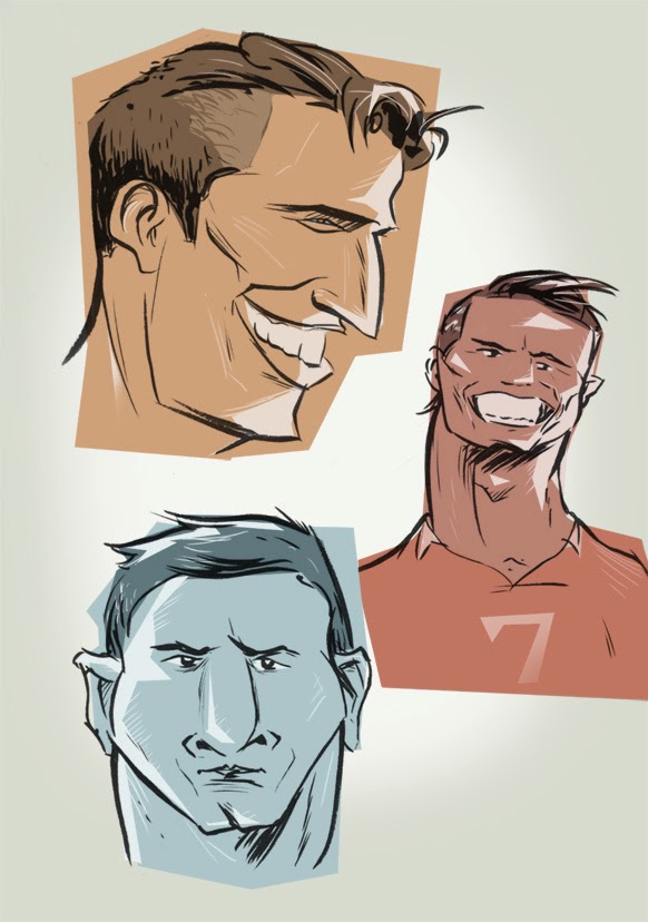
The World Cup is a showcase for the world's best soccer skill that happens once every four years. At the same time, sometimes more prominently, it's also a showcase for men's style. Most sporting events have the players covered up in various layers of equipment, but the European flair of soccer puts wild hair-dos and body art on full display.
I was inspired to do a few drawings representing some of the cast of characters from this years World Cup. Holland's Robin van Persie, seems like an old-fashioned Hollywood star with his laid back game and coiffed look. Argentina's barrel-chested star Lionel Messi plays the quiet, determined farm boy despite his reputation as the world's best footballer. Portugal's diva striker Cristiano Ronaldo wants the ball all the time, and all eyes on him all the time as well, as he struts around grimacing and switching hairstyles mid-game. And did anyone else notice a lot of afros out there on the pitch this year?
Equally well-known for his role as Magnum P.I. as for his magnificent facial hair, Tom Selleck has a certain presence about him. He seems to have found a suitable screen home as the do-right NY police commish on the show Blue Bloods, where he doles out fatherly and grandfatherly advice while wearing wool indoor sweaters and nursing Irish whiskey. The obvious thing is to marvel at his moustache, but I find myself hoping that his massive body frame will crush the poor soul that dares disagree with him at some point in the show. I did this quick doodle while watching in anticipation.
Looking through different location reference photos called my attention to the new cultural phenomenon of phone addiction. I mean, I knew about it of course, but it's not something you digest the full effect of until you see it made obvious. Twenty years ago, if you were to look through photos, you wouldn't find people sitting around playing with their phones in the background. I'm not sure what they would be doing, if anything. Maybe they'd just have their hands in their pockets instead.
Observations like this are important because artists need to replicate reality often. Patterns, groupings, the way objects fall naturally are all subtle details that make a setting believable. So if you're doing an illustration of a crowd now for example, making it current would require a bunch of people texting on their phones. And more specifically everyone has their own technique too. Index finger tappers, piano fingers, thumb shovers...all different ways you'd see people using their phones.
Here's a new portrait of the late Philip Seymour Hoffman, Academy Award wining actor. Though acclaimed in both Hollywood and the theatre, he is most remembered as a great character actor. This makes sense to me, because I can't remember any specific roles where he needed the spotlight. But then stop and think...he was that dude in Twister, and that manager in Moneyball...and so on, and so on. He was able to make an impression with his characters, while not having to be a star.
For this portrait I originally intended it to be a quick brush drawing. I thought the drawing turned out ok, but it seemed to lack a bit without his ultralight blonde hair, so I put down some pastel shades to complete it.
I thought It would be fun to add some colour to this recent sketchbook drawing of a girl in London. The photo it was based on had some interesting lighting...that really bright golden sunset kind, where you feel like the light is almost shining right through things.
I didn't want to replicate the photo in any way, but instead was looking to capture the actual feeling you get, being in a place at that time, where everything seems to be glowing and hazy. I found that by adding colour overlays and various tweaks, I was able to enhance the drawing, and give it the dreamy quality it needed.
Here's a recent illustration I did for an article about discovering yoga. It explores the ups and downs of the yogi boho life for the unathletic and how as it turns out, it can be pretty relaxing. It's just a different sort of me time.
For the artwork I wanted a fun drawing with some cool drowsy tones. I've been enjoying watercolour lately and it just felt right to throw some in to add a little texture and moodiness.
In my short trek across Europe I managed to squeeze in some quick sketches. Packing Amsterdam, Paris and London into a span of under nine days didn't seem to leave much time for doodling, despite the ample material. Mostly I was just dashing off a quick brush doodle without much detail, before moving on to the next spot. Overall, cafes and pubs were filled with tempting subjects, as was the architecture (minus all the windows), not to mention inspiration from world famous museums that had me itching to draw. A British waitress even asked me, Simon style, if I was doing some "drawering".
Here's a little drawing of a house downtown I've been working on. Some houses can be pretty broken down and uncared for, and giant eyesores...but if every house was a brand new executive in the suburbs there wouldn't really be anything to draw. Buildings have unique character just like people, from the cracks in the walls to the style of window pane.
This particular house had a lot of random unique details that kind of called out to me. Crazy chipped walls, uncut grass, white mod chair, broken shades...the list goes on. I just thought it would be a fun subject to experiment with layering on top of an ink wash. I drew out the house more detailed than normal in pencil, then did a grey wash over top to start. After that I added in some digital colours, tweaking some of the watermarks, and really exaggerating the aged feel with some grunge brush texturing. At the same time I was trying to picture what it might have looked like brand new in all its glory, without the dirt cloud of neglect
A good drawing is an important starting point, but it doesn't always end up producing a good illustration. Things like emotion, atmosphere, colour, composition and purpose all come into play and can throw your artwork off. Sometimes I'm haunted by messing up a drawing or concept that I thought could have been way better.
Take this idea of a girl wearing her heart on her sleeve, and a boy being a potential heartbreaker. I initially did it over six years ago. Pretty ancient. And not the most original idea, but I liked certain aspects of it and felt I didn't do it justice. Both the original and the reworking were way to dull. Over inked, boring colour and no emotion which was vital to the idea. I finally gave it another go, giving it a warm atmosphere with a watercolour effect while taking out detail and the background, and then dropped in a hand drawn song quote as well. I think overall it sets the mood much better, and for now I can finally sleep.
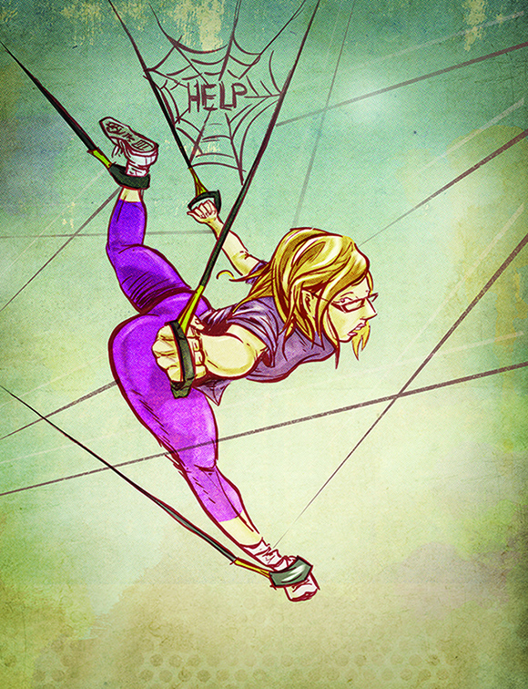
I wanted the drawing to tread the line between limbs flailing wildly and new found acrobatic abilities, while sticking with the prey analogy and showing a sense of vulnerability with negative space. The art was drawn and inked and then coloured and textured digitally in Photoshop. I also couldn't resist the Charlotte's Web reference, since really, how often does the opportunity ever present itself?
My last post got me interested in looking back through some sketchbooks for drawings I've done while travelling. I came across an interesting mix of locations and styles and subjects, though there aren't as many travel sketches as I'd like. I blame the delicate balance of actually finding the time on a trip to sit down and draw something decent and having the option of snapping a photo to work on something later. Sketches are usually better, but just not always possible. Everytime I flip through Craig Thompson's European travel diary Carnet De Voyage it reassures me it's worth the time though. Here are from top left: airport sketch, NYC transit sketch, Cuban pianist, San Fran lookout, Times Square, beach study, Mykonos, Cuba resort, Havana window
Being in the middle of planning a trip and appreciating the beauty of the European rail system, I think that this old drawing is fitting. Sometimes I marvel at the patience of previous projects. I pretty much avoid things requiring rulers at all costs, yet at some point I managed to produce an inked technical train station drawing complete with marker rendering. There are parts of it that are sloppy, but I doubt I'd have the patience to work out something like this today. Tastes and interests change, and I guess I'd just prefer to be on the train instead and snap a pretty picture.
Just keeping busy with some little author spot sketches. Since it's hard to sync up contributor photos to look the same without an actual photo shoot, magazines often use illustrations instead. Sometimes they can even be some of the best art in a publication. It's too bad that most people skip over the contributor page because it always ends up buried somewhere near the front between a bunch of ads.
These portraits were done in ink, with some digital grey wash added, and benefit nicely from being shrunk down in size from the original art.
When I was younger I would come up with a Christmas art-type project to fill up the free time away from school on Christmas vacation. I was always totally hyped about Christmas and loved everything to do with it, including the special cartoons and books. Often my project would be a Christmas book of my own...which tended to involve drawing up a cover and character sketches and then not getting to actually finish the story as my enthusiasm waned.One particular project I recently unearthed, is most notable to me because I did actually finish it in time for Christmas. As a twelve year old, I completed my own version of the classic The Night Before Christmas, beginning December 1st and finishing on Christmas Eve. It turned into a completely stressful ordeal, the thought of not finishing my book in time literally haunting my sleep. Each page featured a full colour illustration, and as the book goes on, they become more and more obscure as I rushed to get it done.
By far my biggest mistake was to write each page's text in alternating red green typewriter serif. Perhaps a little too ambitious. I still remember this project being my first introduction to the serif typeface though...and it actually helped me to memorize all the letter forms...still ingrained twenty years later