


Aside from the one-upmanship, the cleaner, more concise format might actually entice people to read about your year without committing a whole day of theirs! I've never done a Year in Review, but this fine looking work printed at Cleanwash Letterpress has me reconsidering for next year.

 It this new series of fitness club billboards, the goal was simple. Catch people's attention with athletic imagery, while offering them the chance of empowerment without all the usual spew of insulting their current body, or how their life will immediately change for the better. Fitness is an evolving process, that should be in enjoyed in itself, as well as the end results.
The imagery was layered with bright light flares, showcasing the athlete's transformational state. Aside from blending into a black background, and giving the photos a metallic tint, sweat spray was added in, to give it that extra power workout at the gym feel.

In this refreshed design for an association of conference centres, the focus is on the people aspect, instead of facilties and size of rooms. Warm colours create an inviting atmosphere for both the tradeshow pull-up and double-sided rack cards.


There are all kinds of different tradeshow booths at events, especially tourism ones, ranging from crazy set designs and luxurious props, to gimmicky costumes and poorly designed graphics. In a continuation of an existing "Inspired Conferencing" theme, this display ended up being a photoshoot followed by many long hours of photoshopping together a garden panorama at a 20 foot resolution. Combined with hundreds of hand drawn idea doodles overlayed on top of it, it was the type of project that didn't really ever seem to have an end in site.
Fortunately it did eventually see completion, and was creatively combined with real flowers, garden rocks and a bird bath, to bring the garden to life off the display and into the third dimension. Conferencing is often a dull theme, so something of this visual nature providing a different look and feel, successfully stood out from the crowd. In fact, it ended up being voted one of the five hottest booths at the show by Cvent, the only one which actually utilizing simple designed graphics.
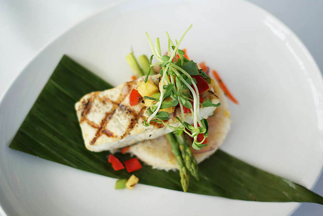
I recently did a little photoshoot for two different restaurants for some advertising images...casual pub style, and upscale fine cuisine. It seems that any type of food can be made into art really, with the help of a skilled chef. These were taken with my trusty 50mm lens and no lighting set-up, as well as very minimal photshopping.




In designing an "inspired conferencing mug" as a conference show giveaway I looked at a few different ways to make it an effective promotion. The slogan and doodles on a black mug, are carried over from an advertising campaign, so the overall branding is sound, and plays on the idea of a great conferencing venue inspiring great ideas. The interesting aspect is that while sitting at a meeting or conference with this mug, not only it is an advertisment and an object that will keep a viewer repeatedly engaged, but it may actually be inspirational on its own...leading to all sorts of doodles and brainstorming. Much more effective than just a plain mug with a logo.

Physically, I wanted to change up the format from a standard brochure, to something more suited to the event. The new single fold tall style brochure, is reminiscent of a common menu shape, hinting at the culinary aspect of the competition. Printed on silk paper, the luxurious tactile quality is fitting for an event showcasing some of the world's top chefs. From a graphic standpoint, the brochure needed more flair and excitement. Focusing on the magical artistry aspect of a cook-off, I created a key main image, as well as some flourishes to give it a modern edge.


Billboards are an exciting form of advertising that have held their own in the digital age. The opportunity to position your message in a high traffic spot, and not have to worry about distribution still goes a long way. Not to mention the esteem that comes along with your branding being out there, large and in charge for the world to see.
In designing a billboard campaign there are a few points I think important to keep in mind. First, the scale is completely different from typical advertising. The print will be huge, so details in retouching and letterspacing are important to be precise on-screen. And second, the billboard will generally not be right in front of a person's face, so the layout must be simple, with careful attention focused on bringing out the key element(s) first. The cool, yet challenging aspect to billboards is having a solid design that works for the entire campaign, so that people can recognize the different locations as being part of the same branding. In the series for The Club at White Oaks, I tried to do just that, promote an inclusive fitness club with an image and only a few words, while giving people a sense that there are more pieces to the puzzle.

Take the packaging for 5, which is constructed of luxurious heavy weight matte black stock, and features pretty much every special printer effect possible. Spot gloss, complex die cuts, embossing, foil graphics...it's all there. To round out the sophistication, each stick of gum is removed from the package like a cigarette. Like every other product out there, gum has caught up, and now expects you to be making a lifestyle statement by whatever brand you flaunt.

The most amazing thing though, is the speed at which web technology evolves. At first, there was nothing but plain html to set-up your website with. All tables and nothing but. Then along came Flash which was hailed as the heroic smasher of restrictive web chains. Then came all sorts of graphic heavy ways of slicing up Photoshop files to get something that actually looked cool. The real gamechanger of the past five years has been CSS. The ability to distinguish presentation from content, and lay an entire site out in a clean, unrestricted fashion and then make easy changes across the site is a remarkable development. Lately everyone has seemed to turn against Flash, but it's still going strong, along with countless other impressive technologies like Ajax, asp, Jquery, CMSs, blogging and social media. Throw the newcomer html5 into the mix and it's pretty much the wild wild web all over again.

While the old logo and its typical grocer blocky typography could certainly benefit from a refresh, the new version is entirely questionable. It just doesn't really make sense...some sort of custom middle-eastern script fusion logotype that looks like one of the the fonts you get in the 10,000 free fonts packs. It doesn't feel very contemporary or have any connection to the fresh local market vibe that Zehr's interiors are going for. Then throw the old serif Markets which really doesn't fit in, and its one heck of logo grab bag. Should have just stuck with the old logo
After several months in the making, the new website is finally launched. Featuring a ton of new portfolio content and a streamlined navigation system, jasondwyer.ca, is a new and welcome departure from the old site. I toyed around with several looks before going with clean and simple, which puts an emphasis on the work and not on the website.
One big reason for the redesign is that I wanted to include both my Illustration and Design work in the same website. Previously the two halves of me were kept separate, where as now I am just one creative entity. As my focus in art has been drifting into the fine art realm, that aspect has been given showcase room as well.
The other reason for the site redesign is that it has been a long time coming. The old sites were 2.5 and 4 years old, and a lot has changed in the web design world. I wanted to stay fresh with the new technologies and standards and have a web portfolio that is easy to update. The Bill Barilko artwork currently on the main landing page, is a tribute to how long it has taken to finally get around to making the changes. Not quite 49 years. but close enough.
www.jasondwyer.ca


One big reason for the redesign is that I wanted to include both my Illustration and Design work in the same website. Previously the two halves of me were kept separate, where as now I am just one creative entity. As my focus in art has been drifting into the fine art realm, that aspect has been given showcase room as well.
The other reason for the site redesign is that it has been a long time coming. The old sites were 2.5 and 4 years old, and a lot has changed in the web design world. I wanted to stay fresh with the new technologies and standards and have a web portfolio that is easy to update. The Bill Barilko artwork currently on the main landing page, is a tribute to how long it has taken to finally get around to making the changes. Not quite 49 years. but close enough.
www.jasondwyer.ca


Just released for the new year is the redesigned White Oaks Resort Giftcard. The look, which strays from the typically over-extravagant giftcard packaging, is based on the five-star properties' recent campaign of natural excellence. Sometimes simple and understated is the way to go. Flower imagery is used throughout the project and campaign to underscore natural beauty. To continue the green friendly theme, the outerholder is printed on post-consumer recycled craft stock with one colour vegetable based ink. The simple one-fold cardholder tucks into an envelope, for minimum packaging waste.

 In a modern twist on the classic Etch A Sketch creative ethos, customizing and modding products via laser etching, is fast becoming an intriguing method of self expression. People on the internet have even raised money to purchase their laptops by selling corporate logo space on an entirely logo covered case etching. There seems to be very little limitation, as to what is possible.
In order to intrigue clients, and further the resort branding, White Oaks Resort decided to set-up its sales team members with some laser etched laptops of their own. To try and keep it from being too corporate and unremarkable, we planned a design based on a butterfly and nature, which is a recurring theme throughout the resort branding. After delivering the artwork, we expected to get the engraving back, showing as a darker grey on the silver. As it turned out, due to the aluminum casing type, it actually came out engraved as white, which ended up increasing visibility. Overall, the etching came out nice and crisp, and seems to be an effective little mobile advertisement.

Popularized in the current media by tech-savvy publication, Wired, the infographic look is a current trend in design that shows no signs of letting up. A great website for all things infodesigny is FlowingData. The blog is run by a data junkie, and features all things informational. Recent images include Winning Paper, Rock, Scissors strategy, Muppets Name Etymology and How a Giant Shark Took Down an Airplane. Some graphics are more useful and serious than others, but it's definitely worth checking out.
Flowing Data
 Always excited upon receiving mail, I quickly perused the 2010 Applied Arts Illustration and Photography Annual yesterday, after tearing it out of its packaging. That was about the high point though, as things went downhill from there. In summary, the entire issue was a big disappointment for me.
First, there is barely any illustration in the annual. 15 mere spreads. Compared to previous years, a ghost of its former self. This issue is much heavier on the photography, which I don't mind, except I never would have ordered it, much less paid $25 for it. And even worse, there aren't even any articles in this issue. That's pretty sad.
To compound the problem, the illustration included is not all that exciting. Nothing jumps out as being really solid or innovative. A handful of the usual talent, along with a pile of stuff that mostly just reminds me of stock illustration.
What really got me was the presentation. All of the art is presented in dull small boxes, despite the switch over to some kind of grotesque large format vertical magazine. If you go through the trouble to make a magazine an awkward, unusual size, then it should probably be for a reason. And as my final complaint...the magazine was redesigned to feature CMYK printer registration colours. A graphic arts magazine using the CMYK...now that's not too cliche and overused
I felt that the one of the classic high-five sequences deserved some artwork. If you ask me, "cut the pickle, tickle tickle" is way better than "on the roof, you're a goof." But that's just me.


