Jason Dwyer - Designer + Illustrator


  • Inspired by the amazing work being done by comic colourists, I wanted to explore adding some dramatic lighting and atmosphere to a quick inked sketch. Even though the image I was working with wasn't very dark, it lended itself to being heavily in shadow. I wanted to capture a sort of haziness with a bit of dim lighting coming from a window so I built up different layers of desaturated colour and filled in large dark areas to accentuate the highlights. I finished off with some rougher texture to give it a grittier flavour. These are two of my favourite colour experimentation results.
    Continue Reading

    I've been looking at this abstract print for a really long time, and have concluded that it has to be a jaguar. Maybe a hyena even, but mostly jaguar. Printmaking can be an enlightening process as it forces you to rely less on drawing and more on solid areas, and prevents you from becoming too focused on details.

    The original was done as a black print on white paper, with oil paint on glass and has been sitting around for a while, so I thought I'd lend it some new life. Some digital colour and texture were all it needed in Photoshop to make it a bit more interesting, though no less mysterious.
    Continue Reading
    You've only got a few seconds to catch someone's attention with a billboard. Too often people make the mistake of cramming them full of stuff that nobody has time to read. In this recent fitness club billboard campaign, I designed action packed one-word visuals. The giant action word paired with a dynamic image grabs focus as well as states what the ethos of the ad is about at the same time. They are also easily recognizable as a series.

    On the production side, the challenge for a campaign is usually the image. With only a day or two to produce, photoshoots are rare, which means using stock photography and doing something unique with it. You may find one cool image, but it never works out that you find all four that will work together. To match images into a campaign some heavy photoshopping is required. Adding pieces of hands and limbs, styling hair...things like that. In this particular case, only two out of the four were high contrast b/w images, so the others had to be modified. I finished up the look by throwing some texture on the type, and a watercoloury background.


    Continue Reading
    I don't get around to making updates on my main website jasondwyer.ca very often. I guess it's just more interesting to blog about projects I'm currently working on. Something I did decide I wanted to add to my site for the new year though, is a handful of my photography.

    My photos have gotten to the point where they are not so embarassing, and also a medium I find I'm working in more. Often I might be doing photography, illustration and design all on the same piece, so it seems like photography has found its way into my workflow as another way I can have more control over the final results. And with Photoshop I can basically edit or turn an image into whatever I'm picturing in my head rather than being stuck with something that's existing.

    I've added a showcase of different pictures, ranging from gourmet food and advertising to travel snapshots and magazine portraits. Most of my photography is done with my lovely low-end Sony Alpha and a 50mm portrait lens.
    Continue Reading

    It this new series of fitness club billboards, the goal was simple. Catch people's attention with athletic imagery, while offering them the chance of empowerment without all the usual spew of insulting their current body, or how their life will immediately change for the better. Fitness is an evolving process, that should be in enjoyed in itself, as well as the end results.

    The imagery was layered with bright light flares, showcasing the athlete's transformational state. Aside from blending into a black background, and giving the photos a metallic tint, sweat spray was added in, to give it that extra power workout at the gym feel.
    Continue Reading
    Here's a recent sketch of a couple of cool cats who look ready to throw down some old school beats. I was feeling a bit of a street graffiti vibe, so I layered it up with a bunch of digital textures. Collaging strange things together in photoshop and just seeing what flows out of it never grows old. Even though there is an undo button, happy accidents still happen.
    Continue Reading

     There are all kinds of different tradeshow booths at events, especially tourism ones, ranging from crazy set designs and luxurious props, to gimmicky costumes and poorly designed graphics. In a continuation of an existing "Inspired Conferencing" theme, this display ended up being a photoshoot followed by many long hours of photoshopping together a garden panorama at a 20 foot resolution. Combined with hundreds of hand drawn idea doodles overlayed on top of it, it was the type of project that didn't really ever seem to have an end in site.

    Fortunately it did eventually see completion, and was creatively combined with real flowers, garden rocks and a bird bath, to bring the garden to life off the display and into the third dimension. Conferencing is often a dull theme, so something of this visual nature providing a different look and feel, successfully stood out from the crowd. In fact, it ended up being voted one of the five hottest booths at the show by Cvent, the only one which actually utilizing simple designed graphics.
    Continue Reading
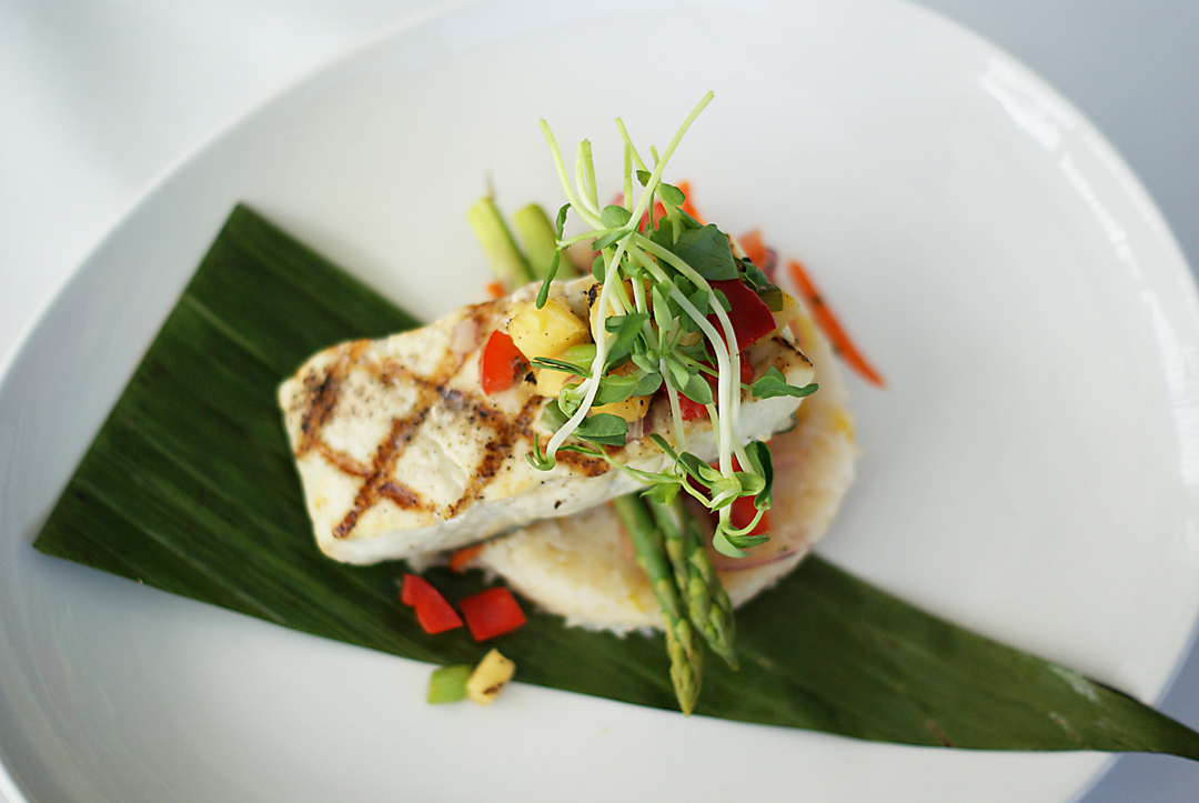
    I recently did a little photoshoot for two different restaurants for some advertising images...casual pub style, and upscale fine cuisine. It seems that any type of food can be made into art really, with the help of a skilled chef. These were taken with my trusty 50mm lens and no lighting set-up, as well as very minimal photshopping.


    Continue Reading
    Sometimes extraordinary people serve as inspiration for art and design. In this case, a magazine photospread, inspired by a group of people who's dedication to fitness and well-being is its own tale of triumph.

    For the photoshoot each person was not available at the same time, so they were shot separately (by Stephen Dominick) and pieced together afterwards by me. Strong rim lighting against a black backdrop was used to give it that determined hero vibe. Afterwards, further dramatic lighting affects were added in photoshop, along with the background atmosphere.
    Continue Reading

     A few weeks ago I began an ongoing project with AMD artist management, helping with their promo materials for local musician Kevin McGowan. His sound is a back-to-basics acoustic folk rock infused with introspective lyrics. To capture this earthy vibe, we headed up to some hiking trails to snap some photos and get some visuals to work with. A key ingredient to the photo shoot was showing up at the right time to capture the golden sunset lighting. Kevin proved to be a natural rock star, and after a couple hours of hiking around with his guitar, we managed to get some pretty decent shots.


    Continue Reading
    While hanging around the ultra-touristy pier area in San Fran, I was treated to my first live dance crew performance. A group of about 6 or 7 guys from across the Bay Bridge in Oakland, materialized with a ghetto blaster and some pieces of cardboard and began to throw down some moves. A few had some skill and the others were fairly sub-par, but all were full of bravado and racial trash-talking. They didn't hesitate to start asking for donations of twenties from the crowd.

    I snapped a series of photos on burst mode of some of the dancers, thinking it would make some interesting action shots. With a little layering and masking in Photoshop, it turned into a crazy multi-limbed bboy creature.
    Continue Reading


    I finally finished up a panorama of the PCH, taken from a great lookout a little ways out from San Francisco. I'd been chipping away at it for a while and was really craving to see it complete. I've included the before and after images, to show what I was working with. I find Photoshop and other programs never really give a decent piece together on any automated settings, so I set all the photos out and line them up as best I can, peeking with transparency. In this case, I used at least 6 photos, to make it a nice long stretch.

    In theory, for panoramas, all the photos should be taken on a manual exposure so the colour and especially the sky will always look the same in each frame. I just fired off some quick photos in sequence, and brought on the extra work...but I guess I enjoy the challenge. After layering things together I synched up the colour as best I could. The most time consuming part was filling in all the missing areas and correcting all of the bad overlaps. I find the key to adding in new chunks is just copying and pasting in chunks from other parts and then using clone and paint to blend it in. Just using the clone tool doesn't work for large areas and creates too much blur. Once everything was patched, I droppped in another whole sky to try and smooth it out, and then merged and adjusted the colour for the whole photo.
    Continue Reading
    Older
    Stories

    About me

    Photo Profile
    Jason Dwyer Designer/Illustrator

    Jason is a multi-discipline artist based in St.Catharines, Canada, working on projects across the creative spectrum including graphic design, web design, illustration, branding, photography and fine art.
    jasondwyer.ca

    Follow Us

    • twitter
    • instagram

    recent posts

    Most Popular

    • New Old Zehrs logo
    • Paint it Black-Awesome Inkers
    • Hipster Life
    • King of LA

    Blog Archive

    Labels

    • Jason Dwyer
    • Jason Dwyer design
    • Jason Dwyer illustrator
    • Jason Dwyer painting
    • Niagara artist
    • Photoshop
    • advertising
    • book illustration
    • branding
    • colour
    • comic
    • conceptual
    • creativity
    • design
    • digital art
    • doodle
    • drawing
    • editorial illustration
    • environmental signage
    • food photography
    • gallery
    • graphic novel
    • hockey
    • home reno
    • illustration
    • ink
    • inspiration
    • landscape
    • media
    • mixed media
    • packaging
    • painting
    • photography
    • portrait
    • printing
    • review
    • sketching
    • travel
    • typography
    • urban art
    • web design
    facebook Twitter instagram pinterest bloglovin google plus tumblr

    Created with by BeautyTemplates | Distributed By Gooyaabi Templates

    Back to top