Jason Dwyer - Designer + Illustrator


  • I discovered a few new painters whose work I'm really enjoying. I consider them painter's painters, which to me means they do not tried to hide the fact that their art is a painting, and they push the medium with confidence.


    Jason Shawn Alexander
    Based out of LA, this artist/illustrator has some brilliant brushwork. He specializes in figurative subjects, with loose drippy brush strokes and an awareness of the emotions they create. Even his black and white work really stands out, with a great variety of mark-making and emotive range. His work initially reminded me of Kent Williams, who as it turns out, he shared a studio with for some time.


    Joram Roukes
    This young Dutch painter already has a solid international fan base for his large oil paintings which offer interpretations of Western society. He combines muted greys with splashes of brighter colour, and his work with its collaged feel, and mix of animals and humans, produces a unique fragmented reality.


    Continue Reading
    I'm not sure if I've ever done a blog post on Colorado based artist Evan Hecox, but really he's probably worth two anyways. I've been finding his graphic work of urban inspired environments quite captivating. It seems like he is able to narrow down his subjects to the essential elements, while at the same time luring you in with plenty of detail.


    Hecox delves into mixed media effortlessly, changing up his style and subject matter when it suits him, and it whatever he does seems to suit the work quite well. He transitions between traditional prints on newspaper, and acrylic paintings on metallic paper and drawings with a sketchy graphic feel. Check out his blog for some really great pics of his works in progress and his conceptual process
    Continue Reading
    In my short trek across Europe I managed to squeeze in some quick sketches. Packing Amsterdam, Paris and London into a span of under nine days didn't seem to leave much time for doodling, despite the ample material. Mostly I was just dashing off a quick brush doodle without much detail, before moving on to the next spot. Overall, cafes and pubs were filled with tempting subjects, as was the architecture (minus all the windows), not to mention inspiration from world famous museums that had me itching to draw. A British waitress even asked me, Simon style, if I was doing some "drawering".


    Continue Reading
    My last post got me interested in looking back through some sketchbooks for drawings I've done while travelling. I came across an interesting mix of locations and styles and subjects, though there aren't as many travel sketches as I'd like. I blame the delicate balance of actually finding the time on a trip to sit down and draw something decent and having the option of snapping a photo to work on something later. Sketches are usually better, but just not always possible. Everytime I flip through Craig Thompson's European travel diary Carnet De Voyage it reassures me it's worth the time though. Here are from top left: airport sketch, NYC transit sketch, Cuban pianist, San Fran lookout, Times Square, beach study, Mykonos, Cuba resort, Havana window
    Continue Reading
    Check out the impressive movie inspired artwork by Massimo Carnevale. I don't know much about him, other than that his blog has literally tons of these paintings. Your favourite movie is probably there...he's got all the greats ranging from Back to the Future to The Goonies. His painting style reminds of a digital Drew Struzan, the king of hand-painted movie posters.


    Continue Reading

     One of the best parts about the web is its ability to showcase things from all over the world. A few clicks and you can be transported half way across the globe. When looking for creative inspiration, it sort of amounts to a mega library card!

    I stumbled across an illustrator all the way from Belarus, Anna Redko, whose work is really looking cool to me. Quality drawings with an interesting textural feel, plus an amazing sense of colour balance. While we may not speak the same language, illustration is pictoral and very much like mathematics, is unversal.

    Continue Reading
    It's good to use up bits of random illustration board and paper scraps instead of throwing them away. In fact, sometimes it even turns into something useful. Here are a few portraits I painted in oil, over top of some collage leftovers, and on oddly cut boards. One of my favourite things about oil paint is the ability to carve back into it before it dries. I find working outside of the box and the normal frame dimensions can add a new perspective or generate fresh ideas when least expected.
    Continue Reading
     At some point in time I got the idea to paint a faux exposed brick backsplash in the kitchen. It seemed more attainable than either a real brick wall or tiling for any number of reasons. I did underestimate the time it would take, which despite succesfully not rendering every little brick detail, ended up being a bit of a journey. But as Teddy R said, "Nothing in the world is worth having or worth doing unless it means effort, pain, difficulty..."


    The process began with two coats of drywall compound, in rows of brick strokes. The natural stopping and starting, as well as overlap, created the 3-D shape of bricks, along with some interesting textures. I sponged it as it was drying for more texture. Next I gave the area a warm basecoat and  began laying my yellows following the basic brick pattern. I used about 7 different warm colours in total, being particular about which colours I mixed and trying to keep a realistic pattern. Some of each colour was saved to drybrush over top of the solids and work some colour harmony and texture in. I followed that with some toothbrush spatters.

    The step of painting in the mortar took a while, as I followed the existing texture to seperate the bricks. As I worked, I drybrushed over certain areas, to add aging and crumble and fade out pieces of brick. Finally, I completed the look with a light airbrushed shadow underneath each brick. Overall it turned out surprisingly well, actually more so in person than photos. One of the stranger murals I've done.

    Continue Reading
    An illustrator whose work I've been checking out lately is New York based artist Michael Marsicano. I first saw some of his drawings while watching the 30 for 30 documentary Benji on TV, about a murdered Chicago high school basketball great. The movie was intriguing but I found myself lured in by the opportunity to see more storyboard-like sketches throughout the film. 

    I had to search around a bit afterwards but finally discovered that the moody illustrations were produced by Marsicano. He does some great work with a loose sketchy feel, and along with his storyboard stuff (which includes a classic Jameson Whiskey commercial), he's also had editorial illustration in publications like the New York Times and Globe and Mail.
    Continue Reading
    I don't get around to making updates on my main website jasondwyer.ca very often. I guess it's just more interesting to blog about projects I'm currently working on. Something I did decide I wanted to add to my site for the new year though, is a handful of my photography.

    My photos have gotten to the point where they are not so embarassing, and also a medium I find I'm working in more. Often I might be doing photography, illustration and design all on the same piece, so it seems like photography has found its way into my workflow as another way I can have more control over the final results. And with Photoshop I can basically edit or turn an image into whatever I'm picturing in my head rather than being stuck with something that's existing.

    I've added a showcase of different pictures, ranging from gourmet food and advertising to travel snapshots and magazine portraits. Most of my photography is done with my lovely low-end Sony Alpha and a 50mm portrait lens.
    Continue Reading
    Another year to wrap up and strangely 2012 seems memorable mostly for news events to me and not much else. I guess it's hard to top all of the Obama drama, storms and shootings, as far as lasting impressions go. Here are some of my notables for the year 2012:

    Favourite New TV Show: Elementary
    Just happy to have a mystery show where the mystery isn't solved by csi forensic computer magic.

    Favourite Movie: 21 Jump Street
    This was actually very funny. Though I haven't even seen Dark Knight Rises or The Hobbit so I'm not sure it's a fair win.

    Favourite Graphic Novel: Jerusalem by Guy Delisle
    An intriguing view of the Holy Land through the eyes of an outsider feauturing art with just the right amount of detail. Runner-up to Michael Cho for his art book, Back Alleys and Urban Landscapes.

    Favourite Book: Not much of what I read this year jumped out at me, but I guess I enjoyed the final book of Tad Williams fantasy series Shadowmarch if I had to pick.

    Favourite Album: Again not much stood out this year...mostly delving back further into the 90's, but the new Ben Folds Five album The Sound of the Life of the Mind was decent.

    Favourite Restaurant: Rise Above
    Good vegan eats in St.Catharines in an artsy setting at good prices.

    Favourite New Drink: Vanilla Spiced Whiskey
    Warm stroke of genuis.

    Continue Reading

    When I was younger I would come up with a Christmas art-type project to fill up the free time away from school on Christmas vacation. I was always totally hyped about Christmas and loved everything to do with it, including the special cartoons and books. Often my project would be a Christmas book of my own...which tended to involve drawing up a cover and character sketches and then not getting to actually finish the story as my enthusiasm waned.

    One particular project I recently unearthed, is most notable to me because I did actually finish it in time for Christmas. As a twelve year old, I completed my own version of the classic The Night Before Christmas, beginning December 1st and finishing on Christmas Eve. It turned into a completely stressful ordeal, the thought of not finishing my book in time literally haunting my sleep. Each page featured a full colour illustration, and as the book goes on, they become more and more obscure as I rushed to get it done.

    By far my biggest mistake was to write each page's text in alternating red green typewriter serif. Perhaps a little too ambitious. I still remember this project being my first introduction to the serif typeface though...and it actually helped me to memorize all the letter forms...still ingrained twenty years later
    Continue Reading
    I know the traditional family Year in Review Christmas letter is always a hot topic for debate. Some people love it, while others can't stand the the whole premise of bragging about your life. Who knows where it actually even originated from. But think about how much cooler it it would be, if it was a nicely designed infographic, one-page letterpressed presentation.

    Aside from the one-upmanship, the cleaner, more concise format might actually entice people to read about your year without committing a whole day of theirs! I've never done a Year in Review, but this fine looking work printed at Cleanwash Letterpress has me reconsidering for next year.
    Continue Reading
    In the age of the finger, when digital devices are all controlled with subtle flicks and pinches, the uniqueness of one's own fingerprint can be easily forgotten. Digital artist il Dito (Italian for finger) takes this idea further by stating that we live in digital lives, hiding behind masks, afraid of our own fragile fingerprints. Enter Ditology ... his series of finger tip portraits, capturing likeness ranging from Steve Jobs and the Dalai Lama to himself, all on the tiny finger size scale.

    The simplification of characters works like a charm, their likenesses easily recognizable, despite being limited to a finger-tip shape. Dito explores a wide variety of subjects, showcasing just how limitless his chosen medium is. Hair, masks, make-up and glasses all add in the subtle details that make his tiny portraits visually huge.
    Continue Reading
    Here's some sketching from an afternoon at Starbucks. I was surprised to see the diversity and also the actual amount of people lounging around in a coffee shop during the middle of the day, at a spot nowhere near a university or pedestrians. And especially surprising was that it seems Starbucks is luring the senior population over from Tim Horton's. Must have something to do with the comfy chairs. My only complaint is that at five dollars a beverage, somebody should really be doing my sketching for me so I can relax more.
    Continue Reading
    As a connoisseur of brush pen sketching, I got overly excited after stumbling across a little blog by artist Davis Chino. Brush Pen Paris features his sketches from a trip in Paris, soaking up the cafe culture. Everything has just such a great European feel, like an animated film vibe, of say, Ratatouille.

    The drawings of interesting character studies are quite vibrant and loose, both keys to working with brush pens. Davis also has another more current site with other sketches, Brush Pen Breakfast.
    Continue Reading
     Really great artistic work is going on all around the world, and if you're lucky enough, you stumble across it. Just be nice to the internet gods! Recently, some great sketches by Ukraine based illustrator Artem Krepkij happened to catch my eye, and I've been checking his blog regularly ever since.

    His illustrations are just a wild mixture of distorted perspective and elongated figures along with feverish pencil scratches and thrown in colour bursts. The great freshness and looseness in the drawings is something that can't be faked, you've either got it our you don't. Some of my favourites are his straight-up sketch book series which focus mainly on pencil portraits, but even his published work maintains his unique emotional style.


    Continue Reading
    Artists are always seeking out unconventional ways to create works that are both visually and creatively challenging. Anything from lego sculptures to canvasses made of used bubblegum, someone out there can turn it into a work of art. One recent artist that caught my eye, is pin-master Eric Daigh.

    Eric has been winning accolades and awards from art fans and collectors alike, for his giant pushpin mosaic portraits. The Michigan- based artist uses literally thousands of coloured pins, placed one at a time in a grid like fashion to create large photographic portraits. The time consuming process is like a zoomed in version of the printing process, where millions of tiny dots of a few colours, are printed to become photo images. The further you stand from his art, the more more realistic it becomes. Daigh's personal interest in the process has to do with travelling from the intangible to the singular and an appreciation for repetition and focus.
    Continue Reading
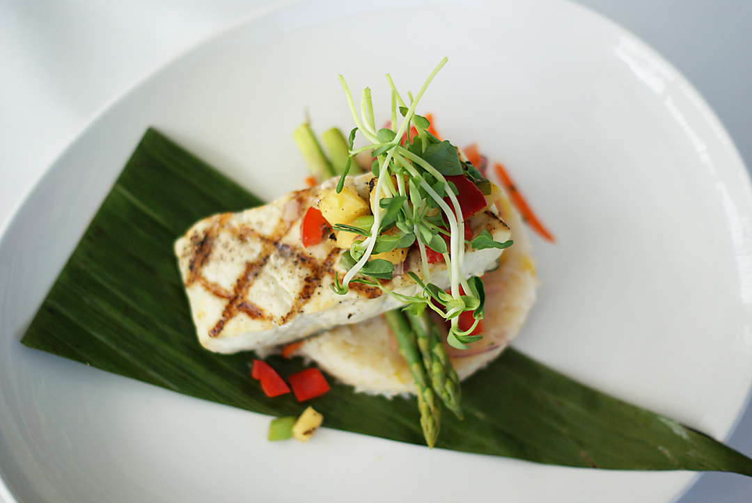
    I recently did a little photoshoot for two different restaurants for some advertising images...casual pub style, and upscale fine cuisine. It seems that any type of food can be made into art really, with the help of a skilled chef. These were taken with my trusty 50mm lens and no lighting set-up, as well as very minimal photshopping.


    Continue Reading
    All artist's have a favourite medium to work with. A special bond with a creative material or process, that is guaranteed to bring out cool ideas or great work. For me, oil paint is my best friend. I've been missing it lately, since I've been weighed down in a longer-term acrylic project, but I know whenever we meet, good things happen.

    Oil is the paint of all paints, and the preferred medium of most modern masters. It is an amazing medium for several reasons. First, the dry-time makes painting more relaxing and more of an exploration. You can mix paints on your palette, that are good for several days which allows for less wasted paint and the ability to have a second sitting if you need it. On the canvas as well, you have time to apply paint and blend later, or even blend colours directly on your surface. Either way it provides for a nice, loose painterly effect. Secondly, the ability to thin out or go thick impasto makes for a powerful choice. Using some thicker paint in spots can literally add a third dimension to your work. All of these benefits apply as well to water mixable oil paints...same great smell but less chemical brain damage!
    Continue Reading
    Older
    Stories

    About me

    Photo Profile
    Jason Dwyer Designer/Illustrator

    Jason is a multi-discipline artist based in St.Catharines, Canada, working on projects across the creative spectrum including graphic design, web design, illustration, branding, photography and fine art.
    jasondwyer.ca

    Follow Us

    • twitter
    • instagram

    recent posts

    Most Popular

    • New Old Zehrs logo
    • Paint it Black-Awesome Inkers
    • Hipster Life
    • King of LA

    Blog Archive

    Labels

    • Jason Dwyer
    • Jason Dwyer design
    • Jason Dwyer illustrator
    • Jason Dwyer painting
    • Niagara artist
    • Photoshop
    • advertising
    • book illustration
    • branding
    • colour
    • comic
    • conceptual
    • creativity
    • design
    • digital art
    • doodle
    • drawing
    • editorial illustration
    • environmental signage
    • food photography
    • gallery
    • graphic novel
    • hockey
    • home reno
    • illustration
    • ink
    • inspiration
    • landscape
    • media
    • mixed media
    • packaging
    • painting
    • photography
    • portrait
    • printing
    • review
    • sketching
    • travel
    • typography
    • urban art
    • web design
    facebook Twitter instagram pinterest bloglovin google plus tumblr

    Created with by BeautyTemplates | Distributed By Gooyaabi Templates

    Back to top