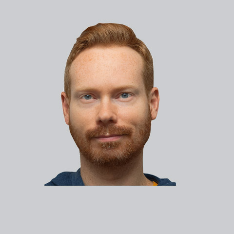
If you're in town through December and January, be sure to check out a solo show of my paintings and sketches at Lock Street Brewing Co. in historic Port Dalhousie. With a launch night of Dec 29 (8pm-11pm), the collection features paintings and sketches of familiar hometown icons such as General Motors, the drydocks, Cloth Co, Facer St., portraits & more.
Every time I venture into an abstract painting I find myself somewhat lost. I guess the point is that by the end of the painting you should have found something along the way but with abstract works, I just never know when the journey is complete. There is a good amount of layering, making marks and covering them up, in this case across a six foot canvas for a conference room...but unless you regularly work in the abstract there is always the urge to improve upon it.
There is great challenge to be had, in reducing something down to to basics of colour and composition. I found this piece to be unique, actually going into it with a bit of a plan and colour tone, but finding out quickly that doing what feels right actually is the logical choice. Putting constraints on drips and splatters of paint is not a very sane thing to do.
Sometimes I've got my head in the clouds. But it's more of a useful thinking mode when you need to come up with ideas and solutions. Not at all related to the snooty head in the clouds, which is more of an I'm the most important person on the planet and I can't be bothered with doing anything for myself and mortal thoughts in general vibe.
Infinitely more annoying, the latter inspired this painting on wood which I did I think a few years ago. It's notable as it involves clouds, which I hate to draw or paint. Something about their insubstantialness.
I don't get around to making updates on my main website jasondwyer.ca very often. I guess it's just more interesting to blog about projects I'm currently working on. Something I did decide I wanted to add to my site for the new year though, is a handful of my photography.
My photos have gotten to the point where they are not so embarassing, and also a medium I find I'm working in more. Often I might be doing photography, illustration and design all on the same piece, so it seems like photography has found its way into my workflow as another way I can have more control over the final results. And with Photoshop I can basically edit or turn an image into whatever I'm picturing in my head rather than being stuck with something that's existing.
I've added a showcase of different pictures, ranging from gourmet food and advertising to travel snapshots and magazine portraits. Most of my photography is done with my lovely low-end Sony Alpha and a 50mm portrait lens.
My photos have gotten to the point where they are not so embarassing, and also a medium I find I'm working in more. Often I might be doing photography, illustration and design all on the same piece, so it seems like photography has found its way into my workflow as another way I can have more control over the final results. And with Photoshop I can basically edit or turn an image into whatever I'm picturing in my head rather than being stuck with something that's existing.
I've added a showcase of different pictures, ranging from gourmet food and advertising to travel snapshots and magazine portraits. Most of my photography is done with my lovely low-end Sony Alpha and a 50mm portrait lens.
New illustration out about a first-time golfer's experience trying to learn the game. Which, as it happens, was full of follies and frustrations. This one ended up a little more colourful than normal on account of the pink. As well, since the inking is looser than usual, I actually went in with some detailing and did a bit more than flat colours.
Here's a recent sketch of a couple of cool cats who look ready to throw down some old school beats. I was feeling a bit of a street graffiti vibe, so I layered it up with a bunch of digital textures. Collaging strange things together in photoshop and just seeing what flows out of it never grows old. Even though there is an undo button, happy accidents still happen.
Just like any other activity, it's a good idea to keep your painting muscles in good shape...otherwise they might just get flabby. I like to think of this sort of exercise as painting without an agenda. Find whatever surface is laying around the house and start to drop layers onto it. Mix mediums with different types of paints, pastels, solid colours, typography, line work, texture, collage, spray paint...anything you can get your hands on. The more the merrier. The best part is that there is no finish point. Simply stop when you feel the painting is interesting, or store it away to add to again later. Often as in my recent example, crops of the final painting can hold quite a bit of curious details within them.
Spring weather is always sure to draw everybody out from their winter hiding places and into the streets for some shopping, dining and fun. Crowds can be both exciting and a drag to work on, depending on how you look at it. On one hand, they are filled with all sorts of unique characters, locations and props, in a randomized pattern which can make for tremendous compositions. On the other hand, crowds can take a while to complete, and can bog an artist down in details, which can really ruin an overall picture. This is a watercolour and ink drawing of a scene on Queen Street in Toronto.
Here's a sketchbook spread from last year. I find I'm attracted to sketching mostly real things like buildings and people more and more...it seems easy that way. Less thought more drawing. Sometimes it's worthwhile to inject some random out of the brain doodles into the creative routine, just to make sure the noggin is still working. Good ideas often ensue.
This old print always pops into my head now and again...it didn't really turn out the way I wanted, but really probably better. Everything went wrong and there was some fixing up but the spontaneous accidents made it way more interesting. It's like Jackson Pollock used to say that there are no accidents in painting. Done during my do anything on top of old comic book pages period, and featuring a great pose, it's a real keeper
Hot off the presses, is this year's Applied Arts Illustration and Photography Annual, the best lowdown for what's going on in the Canadian graphic arts industry. Overall, the slick matte cover gives off a good vibe, and there are some decent articles inside, as well as the actual photography and illustration award winners. I always feel there could be more illustration featured, but bias aside, at least the photography showcased is pretty amazing.
In the illustration section there are the usual suspects like Rick Sealock and Pol Turgeon, but surprisingly a lot of new faces and fresh talent, which is always good to see. My portrait of Drake, ended up in the portrait section on a spread featuring some other well done portraits including Forest Whitaker and Georges St-Pierre. Here are a few shots of the layout
Check out the article in The Tribune about my painting purchased by the City of St.Catharines. The portrait of Bill Burgoyne Arena, exhibited back in the spring as part of the city's gallery show, seems to be striking a chord with a lot of people. Canadians do like hockey, after all.
http://www.wellandtribune.ca/ArticleDisplay.aspx?e=2970955
After several months in the making, the new website is finally launched. Featuring a ton of new portfolio content and a streamlined navigation system, jasondwyer.ca, is a new and welcome departure from the old site. I toyed around with several looks before going with clean and simple, which puts an emphasis on the work and not on the website.
One big reason for the redesign is that I wanted to include both my Illustration and Design work in the same website. Previously the two halves of me were kept separate, where as now I am just one creative entity. As my focus in art has been drifting into the fine art realm, that aspect has been given showcase room as well.
The other reason for the site redesign is that it has been a long time coming. The old sites were 2.5 and 4 years old, and a lot has changed in the web design world. I wanted to stay fresh with the new technologies and standards and have a web portfolio that is easy to update. The Bill Barilko artwork currently on the main landing page, is a tribute to how long it has taken to finally get around to making the changes. Not quite 49 years. but close enough.
www.jasondwyer.ca
One big reason for the redesign is that I wanted to include both my Illustration and Design work in the same website. Previously the two halves of me were kept separate, where as now I am just one creative entity. As my focus in art has been drifting into the fine art realm, that aspect has been given showcase room as well.
The other reason for the site redesign is that it has been a long time coming. The old sites were 2.5 and 4 years old, and a lot has changed in the web design world. I wanted to stay fresh with the new technologies and standards and have a web portfolio that is easy to update. The Bill Barilko artwork currently on the main landing page, is a tribute to how long it has taken to finally get around to making the changes. Not quite 49 years. but close enough.
www.jasondwyer.ca