Jason Dwyer - Designer + Illustrator

  • I'm generally not a fan of the repetitious nature of graphic design trends. Overall, visuals just get to be very repetitive without much thought. Hipster lo-fi, icons, big beards... too much of that everywhere. Sometimes it's fun to play around a bit and throw in some cliche elements just because, but otherwise I try and stay of the moment without diving into trends.

    I had some fun experimenting with textures and a Kid Rock quote in hipster style fonts.


    And I worked in some super simplified icons in a poster style, to go along with a quote from Taylor Swift's Bad Blood.


    I also felt like I needed to draw a big bearded fellow with lots of tattoos.


    More of my work can be seen at http://www.jasondwyer.ca


    Continue Reading
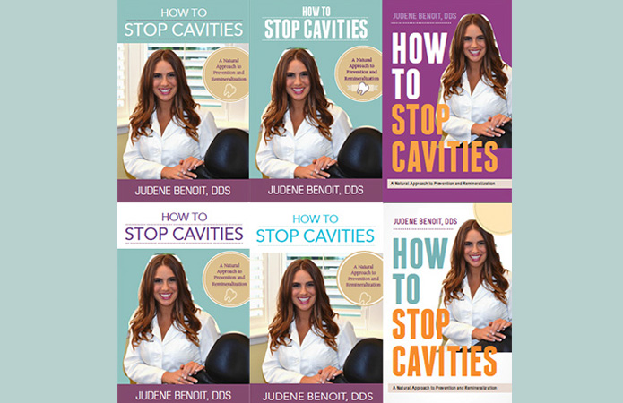
    Earlier this year I was approached by Dr. Judene Benoit with an interesting project. She had just written a book on natural cavity prevention and remineralization, and needed a cover designed for it. I had never designed something book related of a medical non-fiction nature and it presented some unique challenges.

    The obvious design quandary was how to stay within the usual medical realm (which is traditionally dull and features a standard author pic), so as to not alienate industry professionals, while at the same time keeping it fresh. Another target demographic of the book slants towards the younger, total health philosophy crowd, which is more at home in the yoga studio or health food aisles rather than a lab. I drew visual influence from cookbooks and fitness books while steering clear of making it look too close to Dr. Phil’s latest release.


    We looked at a handful of typefaces and colour palettes in the concepts and in the end decided that cool tones on crisp white with spacious type, worked really well with a warm, inviting author photo. It struck just the right amount of balance of not intimidating the average health-minded individual while still feeling at home on a doctor’s bookshelf. We continued on with the feel through Dr. Judene’s website, which offers podcasts, blogs and info on her book signing appearances.
    Continue Reading
    Here's a look at a menu redesign project for Play Urban Cafe. They wanted to maintain their feel of a fun sophisticasual dining and drinks experience, but change things up a bit. Since so many new healthy and vegan options were added to the menu, the layout is open-spaced with plenty of room for feature boxes to highlight health facts etc. With the menu spanning over several pages in a fold-out holder, it was important to keep styling consistent throughout, and have an easy to follow system so that patrons can understand various gluten-free and vegan substitutions. Instagram and Twitter tags were added as well, since foodie pics are bound to happen.

    As the new menu launched, I was also able to take some photos of the healthy pub grub for future design use. Shot without lighting or a formal set-up, the photos are done quickly and sometimes produce unique results.


    Continue Reading
    I know the traditional family Year in Review Christmas letter is always a hot topic for debate. Some people love it, while others can't stand the the whole premise of bragging about your life. Who knows where it actually even originated from. But think about how much cooler it it would be, if it was a nicely designed infographic, one-page letterpressed presentation.

    Aside from the one-upmanship, the cleaner, more concise format might actually entice people to read about your year without committing a whole day of theirs! I've never done a Year in Review, but this fine looking work printed at Cleanwash Letterpress has me reconsidering for next year.
    Continue Reading
    Sometimes a rebranding happens, and you find yourself wondering what exactly the point of it was. In general, spending a bunch of time/money to take a step in the wrong direction, or even worse, backwards, just isn't a good idea. The redesigned Zehrs logo now going up in store locations across Ontario, is feeling like of those big steps backward.

    While the old logo and its typical grocer blocky typography could certainly benefit from a refresh, the new version is entirely questionable. It just doesn't really make sense...some sort of custom middle-eastern script fusion logotype that looks like one of the the fonts you get in the 10,000 free fonts packs. It doesn't feel very contemporary or have any connection to the fresh local market vibe that Zehr's interiors are going for. Then throw the old serif Markets which really doesn't fit in, and its one heck of logo grab bag. Should have just stuck with the old logo
    Continue Reading
    Randomly scouting large words in the dictionary, sometimes can produce an interesting find. As in this case, I stumbled across a word "defenestration", which is the act of throwing something or someone out a window. A word that says so much, with so little, deserves at least a quick collage. It also helped in the comprehension of the jeopardy category, Defenestration in Cinema.
    Continue Reading
    Older
    Stories

    About me

    Photo Profile
    Jason Dwyer Designer/Illustrator

    Jason is a multi-discipline artist based in St.Catharines, Canada, working on projects across the creative spectrum including graphic design, web design, illustration, branding, photography and fine art.
    jasondwyer.ca

    Follow Us

    • twitter
    • instagram

    recent posts

    Most Popular

    • New Old Zehrs logo
    • Paint it Black-Awesome Inkers
    • Hipster Life
    • King of LA

    Blog Archive

    Labels

    • Jason Dwyer
    • Jason Dwyer design
    • Jason Dwyer illustrator
    • Jason Dwyer painting
    • Niagara artist
    • Photoshop
    • advertising
    • book illustration
    • branding
    • colour
    • comic
    • conceptual
    • creativity
    • design
    • digital art
    • doodle
    • drawing
    • editorial illustration
    • environmental signage
    • food photography
    • gallery
    • graphic novel
    • hockey
    • home reno
    • illustration
    • ink
    • inspiration
    • landscape
    • media
    • mixed media
    • packaging
    • painting
    • photography
    • portrait
    • printing
    • review
    • sketching
    • travel
    • typography
    • urban art
    • web design
    facebook Twitter instagram pinterest bloglovin google plus tumblr

    Created with by BeautyTemplates | Distributed By Gooyaabi Templates

    Back to top