I started to think about how Lebron would actually look in the Lakers purple and gold after his big signing in the summer, which lead to a quick sketch. For some reason whenever I picture him, Lebron is always rolling his eyes. I suppose if all of your nicknames are either god or royalty related, then it kind of makes sense though. And it will fit in well when he becomes a jolly old king.
Here's a new illustration about the sudden fitness popularity of group training. Inspired by shows like The Biggest Loser and the extreme weight loss brought on by trainers acting like drill sergeants, people are grouping up for training. It's easy for trainers with a group to assume they all want the pounds to fly off, even though fitness levels differ. For those less in shape, the experience could be described as hell-ish.

I was struck by some of the unusual colours most of the small towns you pass through in Mexico seem to have on all of the buildings. Lots of bright colours, reds and oranges, not really arranged with any pattern either. Just whatever the owner fancies I guess. The building style as well was interesting, row-ish houses span whole blocks, with some unifying details, while other items like windows vary from building to building. Overall it makes for some unique visuals.
I snapped some photos driving by for sketching material and this is one of the resulting doodles. The line work is done in a very unpicky style, giving way to some light watercolour washes to capture the differences between each quarters.
Latest illustration for an article about the battle to eat healthy. As is the case with many people, a favourite snack food like potato chips can be your kryptonite, standing in the way of a clean eating regimen. Substitutes are usually tried, but to no avail...in this article a particular hatred is developed for kale chips.
Done in ink with digital colour, I started out quite abstract in the rough work, just trying to establish a strong feeling of being weakened by the chips in the pose. I also threw in some Superman references like the red and blue colours, and the draped couch blanket which hints at a cape.
Here's a recent illustration I did for an story about childhood sports endeavors. These tales tend to become either filled with deeds of heroic athleticism or full of impressive misadventures as time goes on. That's what makes them good stories after all!
In this particular instance, the author recounts a short stint as a star grade school pitcher, whose career was ended before its prime by a wayward line drive. Since it took place in the late 70's I wanted to capture that old baseball card spirit and summer camp sort of vibe with the wardrobe details. Technique-wise I experimented in contrasting smooth characters with a textured construction paper type feel for the rest of the scene, set with an outdoorsy colour palette.
It's hard not to take notice of chart-topping rapper Macklemore, both for his success as an independent artist and his unusual fashion sense. As his most popular single suggests, Macklemore does indeed have a love for great thrift shop finds and one-of-a-kind items, which tends to make him stand out even more in the hip-hop community.He also brings to his music insightful lyrics, including songs about homophobia, mocking brand names, white privilege and staying independent, a direct contrast to typical rap songs about fame, money and material possessions.
One of my favourite lyrics about dedication to your craft:
"See, I observed Escher
I love Basquiat
I watched Keith Haring
You see I study art
The greats weren't great because at birth they could paint
The greats were great cause they paint a lot"
In this illustration I envisioned his famous thrift shop coat as a dreamcoat for a knowledge-dropping vagabond. Done in ink with digital colours.
Here's a new illustration for an article on fun winter activities to explore in The Great White North. Some of the other adventures included skating and cross-country skiing, but I focused on dog sledding since it always seems so chaotic. A bunch of maniacal runaway huskies has good action potential.
The art started out with an inked drawing, and I decided early on to focus on adding winter atmosphere as opposed to clean digital colours. The sunset surrounded by greyness and swirling flurries helped to pull it together and add an obvious sense of the frosty Canadian winter.
The birds in the yard can be loud. Loud and mornings don't go very well together. I sometimes wonder what all the chirping is really about...maybe birds are just bellyaching about their early morning commute. Incidents of birdrage may be on the rise.
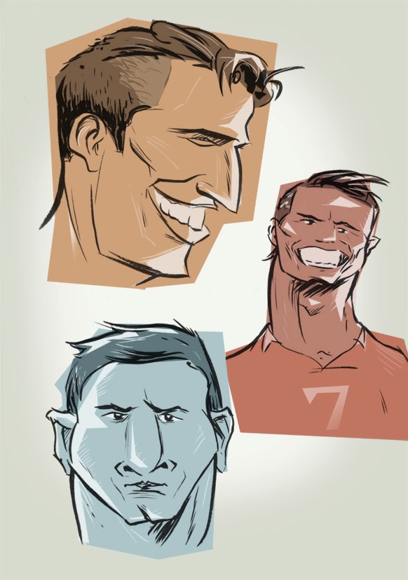
The World Cup is a showcase for the world's best soccer skill that happens once every four years. At the same time, sometimes more prominently, it's also a showcase for men's style. Most sporting events have the players covered up in various layers of equipment, but the European flair of soccer puts wild hair-dos and body art on full display.
I was inspired to do a few drawings representing some of the cast of characters from this years World Cup. Holland's Robin van Persie, seems like an old-fashioned Hollywood star with his laid back game and coiffed look. Argentina's barrel-chested star Lionel Messi plays the quiet, determined farm boy despite his reputation as the world's best footballer. Portugal's diva striker Cristiano Ronaldo wants the ball all the time, and all eyes on him all the time as well, as he struts around grimacing and switching hairstyles mid-game. And did anyone else notice a lot of afros out there on the pitch this year?
It took a long time to complete, but I was finally able to put the finishing touches on the first volume of my hardcover anthology. I thought it would be a cool idea to put together a book that collects the work from my first ten years as creative, and then each decade subsequently after. Given how much effort this one was, I don't know if I'll follow through on that, but it did turn out pretty good.
I used Blurb to produce the book, which allows for real layout flexibility. You can actually design your book right in InDesign and export it into a printable pdf, which is a great benefit compared to just having a few static templates to drop photos into. Other than a bit of crashing and an extremely picky pdf exporter, the entire process was very smooth and turned out the way I wanted. A ton of time was spent just combing through different pieces for inclusion...and fighting the urge to just include all newer work. The end result is a snapshot of my development through design, illustration and fine art.
Equally well-known for his role as Magnum P.I. as for his magnificent facial hair, Tom Selleck has a certain presence about him. He seems to have found a suitable screen home as the do-right NY police commish on the show Blue Bloods, where he doles out fatherly and grandfatherly advice while wearing wool indoor sweaters and nursing Irish whiskey. The obvious thing is to marvel at his moustache, but I find myself hoping that his massive body frame will crush the poor soul that dares disagree with him at some point in the show. I did this quick doodle while watching in anticipation.
Here's an illustration I did for an article about a middle-aged woman's foray into Aqua Fitness. Though it may seem like a simple adventure on the surface, she discovers an unspoken aquafit code. Those not wearing swim caps, nose plugs, full-coverage bathing suits and, in general, moving too fast, can be seen as outsiders by the pack. Aquafit is a serious fitness pursuit, and you must treat it as such.
The full page artwork is done in my typical style but I finally experimented with inking via tablet. I can't really tell the difference from brush, though the tactile satisfaction of paper and ink was missed. I will admit that inking with a tablet is handy when the artwork is detailed and can't be produced at a larger size and shrunk down, but I'm certainly not giving up on the traditional method.
Looking through different location reference photos called my attention to the new cultural phenomenon of phone addiction. I mean, I knew about it of course, but it's not something you digest the full effect of until you see it made obvious. Twenty years ago, if you were to look through photos, you wouldn't find people sitting around playing with their phones in the background. I'm not sure what they would be doing, if anything. Maybe they'd just have their hands in their pockets instead.
Observations like this are important because artists need to replicate reality often. Patterns, groupings, the way objects fall naturally are all subtle details that make a setting believable. So if you're doing an illustration of a crowd now for example, making it current would require a bunch of people texting on their phones. And more specifically everyone has their own technique too. Index finger tappers, piano fingers, thumb shovers...all different ways you'd see people using their phones.
Here's a new portrait of the late Philip Seymour Hoffman, Academy Award wining actor. Though acclaimed in both Hollywood and the theatre, he is most remembered as a great character actor. This makes sense to me, because I can't remember any specific roles where he needed the spotlight. But then stop and think...he was that dude in Twister, and that manager in Moneyball...and so on, and so on. He was able to make an impression with his characters, while not having to be a star.
For this portrait I originally intended it to be a quick brush drawing. I thought the drawing turned out ok, but it seemed to lack a bit without his ultralight blonde hair, so I put down some pastel shades to complete it.
I thought It would be fun to add some colour to this recent sketchbook drawing of a girl in London. The photo it was based on had some interesting lighting...that really bright golden sunset kind, where you feel like the light is almost shining right through things.
I didn't want to replicate the photo in any way, but instead was looking to capture the actual feeling you get, being in a place at that time, where everything seems to be glowing and hazy. I found that by adding colour overlays and various tweaks, I was able to enhance the drawing, and give it the dreamy quality it needed.
Luckily 2013 was the year of Rob Ford. So 2014 really can't get much lower than that. The rotund, sweaty, mess of a mayor of Toronto was a media machine the past year. There was something about his Chris Farley sketch antics that people just couldn't get enough of. Or, maybe it was more of a sign that not much happened in 2013. There weren't any new books, TV shows, albums or movies that gripped me enough to specifically remember them. So I've got nothing to review for my year in review. But who needs content when you can just draw a funny picture of a crack-smoking mayor.
Here's a recent illustration I did for an article about discovering yoga. It explores the ups and downs of the yogi boho life for the unathletic and how as it turns out, it can be pretty relaxing. It's just a different sort of me time.
For the artwork I wanted a fun drawing with some cool drowsy tones. I've been enjoying watercolour lately and it just felt right to throw some in to add a little texture and moodiness.
Sometimes I've got my head in the clouds. But it's more of a useful thinking mode when you need to come up with ideas and solutions. Not at all related to the snooty head in the clouds, which is more of an I'm the most important person on the planet and I can't be bothered with doing anything for myself and mortal thoughts in general vibe.
Infinitely more annoying, the latter inspired this painting on wood which I did I think a few years ago. It's notable as it involves clouds, which I hate to draw or paint. Something about their insubstantialness.
Here's a little drawing of a house downtown I've been working on. Some houses can be pretty broken down and uncared for, and giant eyesores...but if every house was a brand new executive in the suburbs there wouldn't really be anything to draw. Buildings have unique character just like people, from the cracks in the walls to the style of window pane.
This particular house had a lot of random unique details that kind of called out to me. Crazy chipped walls, uncut grass, white mod chair, broken shades...the list goes on. I just thought it would be a fun subject to experiment with layering on top of an ink wash. I drew out the house more detailed than normal in pencil, then did a grey wash over top to start. After that I added in some digital colours, tweaking some of the watermarks, and really exaggerating the aged feel with some grunge brush texturing. At the same time I was trying to picture what it might have looked like brand new in all its glory, without the dirt cloud of neglect
A good drawing is an important starting point, but it doesn't always end up producing a good illustration. Things like emotion, atmosphere, colour, composition and purpose all come into play and can throw your artwork off. Sometimes I'm haunted by messing up a drawing or concept that I thought could have been way better.
Take this idea of a girl wearing her heart on her sleeve, and a boy being a potential heartbreaker. I initially did it over six years ago. Pretty ancient. And not the most original idea, but I liked certain aspects of it and felt I didn't do it justice. Both the original and the reworking were way to dull. Over inked, boring colour and no emotion which was vital to the idea. I finally gave it another go, giving it a warm atmosphere with a watercolour effect while taking out detail and the background, and then dropped in a hand drawn song quote as well. I think overall it sets the mood much better, and for now I can finally sleep.