Here's a new illustration about the sudden fitness popularity of group training. Inspired by shows like The Biggest Loser and the extreme weight loss brought on by trainers acting like drill sergeants, people are grouping up for training. It's easy for trainers with a group to assume they all want the pounds to fly off, even though fitness levels differ. For those less in shape, the experience could be described as hell-ish.
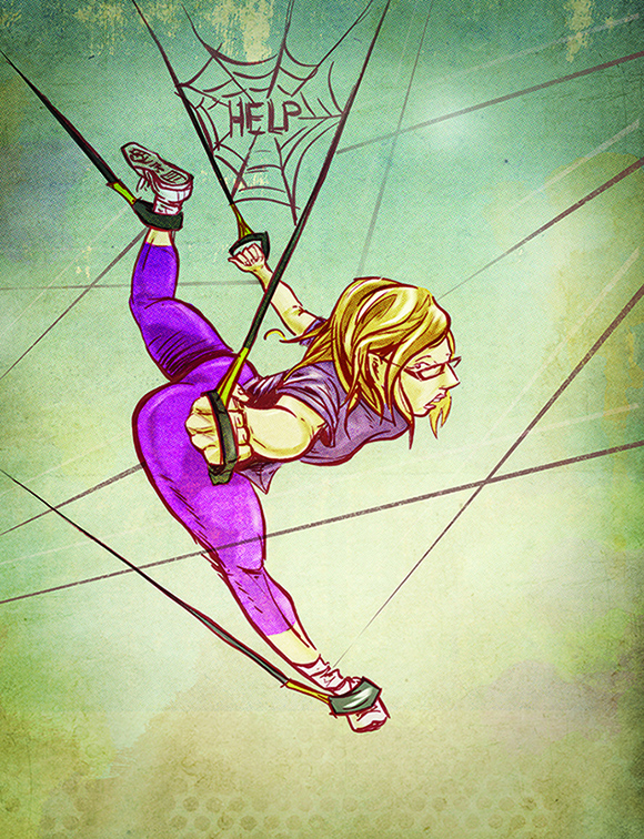
Here's a recent illustration I did for an article about what it's like being introduced to TRX - Total Resistance Training. Gyms continue to offer increasingly unique and imaginative ways to get fit, and TRX is no exception. The main premise is resistance band training, much of it while suspended in the air in awkward positions. To new-comers brave enough to try it out, it lends itself to getting caught tangled up in a bunch of strings, like helpless prey in a spider's web.
I wanted the drawing to tread the line between limbs flailing wildly and new found acrobatic abilities, while sticking with the prey analogy and showing a sense of vulnerability with negative space. The art was drawn and inked and then coloured and textured digitally in Photoshop. I also couldn't resist the Charlotte's Web reference, since really, how often does the opportunity ever present itself?
Billboards are an exciting form of advertising that have held their own in the digital age. The opportunity to position your message in a high traffic spot, and not have to worry about distribution still goes a long way. Not to mention the esteem that comes along with your branding being out there, large and in charge for the world to see.
In designing a billboard campaign there are a few points I think important to keep in mind. First, the scale is completely different from typical advertising. The print will be huge, so details in retouching and letterspacing are important to be precise on-screen. And second, the billboard will generally not be right in front of a person's face, so the layout must be simple, with careful attention focused on bringing out the key element(s) first. The cool, yet challenging aspect to billboards is having a solid design that works for the entire campaign, so that people can recognize the different locations as being part of the same branding. In the series for The Club at White Oaks, I tried to do just that, promote an inclusive fitness club with an image and only a few words, while giving people a sense that there are more pieces to the puzzle.
Jason is a multi-discipline artist based in St.Catharines, Canada, working on projects across the creative spectrum including graphic design, web design, illustration, branding, photography and fine art. jasondwyer.ca