On a trip this summer to Porto this summer, I discovered why it is such a popular tourist destination in Portgual. Aside from the port wine of course, the heritage Ribeira and surrounding area is just packed with scenic lookouts over the water and the city. It was almost an overabundance of spectacular old buildings to take in, to sketch and to photograph. Here are some of the sketches I managed to get when not busy stuffing my face full of olives.

I was struck by some of the unusual colours most of the small towns you pass through in Mexico seem to have on all of the buildings. Lots of bright colours, reds and oranges, not really arranged with any pattern either. Just whatever the owner fancies I guess. The building style as well was interesting, row-ish houses span whole blocks, with some unifying details, while other items like windows vary from building to building. Overall it makes for some unique visuals.
I snapped some photos driving by for sketching material and this is one of the resulting doodles. The line work is done in a very unpicky style, giving way to some light watercolour washes to capture the differences between each quarters.
Luckily 2013 was the year of Rob Ford. So 2014 really can't get much lower than that. The rotund, sweaty, mess of a mayor of Toronto was a media machine the past year. There was something about his Chris Farley sketch antics that people just couldn't get enough of. Or, maybe it was more of a sign that not much happened in 2013. There weren't any new books, TV shows, albums or movies that gripped me enough to specifically remember them. So I've got nothing to review for my year in review. But who needs content when you can just draw a funny picture of a crack-smoking mayor.
As I was doing some drawing and gazing out the window at the masses of tree branches weighed down by snow, and the blanket of white, I was reminded how quickly seasons change. Flip a page or two in my sketchbook back, and I was just sketching this late autumn scene of the house across the street.
It seems easier to remember three months back when the weather was warmer and the days longer, rather than going forward three months. Skip ahead through winter and spring is here again but I guess the rewind button is just more alluring.
Here's a recent illustration I did for an article about discovering yoga. It explores the ups and downs of the yogi boho life for the unathletic and how as it turns out, it can be pretty relaxing. It's just a different sort of me time.
For the artwork I wanted a fun drawing with some cool drowsy tones. I've been enjoying watercolour lately and it just felt right to throw some in to add a little texture and moodiness.
Spring weather is always sure to draw everybody out from their winter hiding places and into the streets for some shopping, dining and fun. Crowds can be both exciting and a drag to work on, depending on how you look at it. On one hand, they are filled with all sorts of unique characters, locations and props, in a randomized pattern which can make for tremendous compositions. On the other hand, crowds can take a while to complete, and can bog an artist down in details, which can really ruin an overall picture. This is a watercolour and ink drawing of a scene on Queen Street in Toronto.
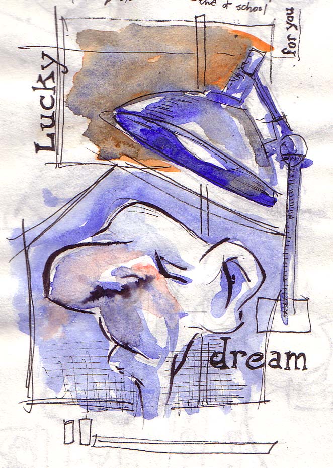
The key to avoiding winter blues and lack of sun, aside from using a SAD lamp, I find, is just curling up with a good book and falling asleep. The long winter's nap! If you're lucky you can dream your way through the entire winter. Bears are pretty bright with the whole hibernation thing. Which brings to mind one of my favourite Christmas books, The Bear Who Slept Through Christmas. Classic!
Fueled by his outrageously entertaining temper, along with his appreciation of the perfect dish, Chef Gordon Ramsay has lambasted his way into the hearts of millions of tv viewers. His fiery Scottish emotions within the context of food television seem to provide the perfect combination of coarse language, abrasive humiliation and not to mention, good food. Viewers all over the world tune in weekly to see one of his many shows including Hell's Kitchen, Kitchen Nightmares and Master Chef.
While he runs his kitchens like a drill Sergeant, Ramsay's oft witty remarks and constant smile peeking out from beneath his glare, lead me to believe he's actually a really nice guy. In painting him, I wanted to capture a bit of this inner warmth, lurking behind his tough guy exterior. As the rough sketch developed, the folds and wrinkles of his face began to take on the quality of a cuddley Shar pei and I began to see him in a new, faithful ol buddy kind of light. But a subtle sharp knife and some flames somehow made their way into the painting...it just seemed...fitting. Yes Chef!
Hot off the presses, is this year's Applied Arts Illustration and Photography Annual, the best lowdown for what's going on in the Canadian graphic arts industry. Overall, the slick matte cover gives off a good vibe, and there are some decent articles inside, as well as the actual photography and illustration award winners. I always feel there could be more illustration featured, but bias aside, at least the photography showcased is pretty amazing.
In the illustration section there are the usual suspects like Rick Sealock and Pol Turgeon, but surprisingly a lot of new faces and fresh talent, which is always good to see. My portrait of Drake, ended up in the portrait section on a spread featuring some other well done portraits including Forest Whitaker and Georges St-Pierre. Here are a few shots of the layout
Straight outta the TDot, and backed by his pseudo street cred earned on the streets of Degrassi, Canadian rapper Drake continues to flex the boundaries of international stardom. Rarely does a musician from the Great White North, successfully make the leap into the U.S. market, but it seems to be no trouble for this actor-turned-rapper. Aside from the Bieb and Drake, it doesn't seem like anyone else from Canada is even making a dent over the border. Aided by a host of big name collaborators, there's no telling how big this Young Money heavyweight will get. However the machine works, Canada doesn't really seem to get this whole complex music promo starpower thing. Which is actually kind of nice.
Portrait done in watercolour on rough board
This year Mother Nature kindly waited till the first of December, to provide the Christmas season's inaugural snowfall. But soon enough, the streets will be covered in the familiar mass of powdered white, slushy grey and hectic holiday shoppers, all muddled together in one big mess.Snow is one of those painful things to paint...I like to lump into the snore category along with clouds and trees. Not surprising then, that I had to venture back about ten years to find a painting of a full winter scene. This one, of the downtown bus terminal area, was done in watercolour on rough paper, and captures well, the cold grey of midwinter.
The more I look at his art, the more Koren Shadmi's work grows on me. The Brooklyn based illustrator has been busy lately, turning up in major magazines across North America. His style is a nice blend of line art with watercolour on rough paper. This combination seems to work well, combining texture, colour and quality drawing with interesting metaphors and concepts. I'm particularly interested in checking out out his foray into graphic novels, IN THE FLESH, a collection of short stories and poems, published by Villard.
www.korenshadmi.com
www.korenshadmi.com
The latest issue of WO magazine has hit the shelves and has a few of my illustrations in it. This one is for an article on how tennis always looks more fun and easier than it actually is. I very much agree on that point, as I've found tennis to get more enjoyable as my skills have increased.
This art was done in watercolour and ink. The other illustration I contributed was digitally done and accompanied a story on long distance treks.
Here's a new watercolour city sketch from not long ago.Watercolour is something I wish I would squeeze more time in for with sketching and painting. It always seems to be the odd man out, falling between large paintings on canvas and sketching in ink brush. It's always a great way to keep a work spontaneous, whatever the project is. I find it to be one of those rare mediums that is able to tell you itself, when the painting is finished and you can put the brush down and relax. Not to mention watercolour is great to throw on some sketches to give them life, and can go with you wherever you go.